
The Astronaut
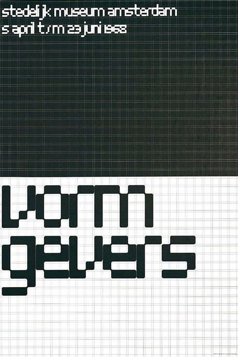
Vormgevers Poster [fig. 1]
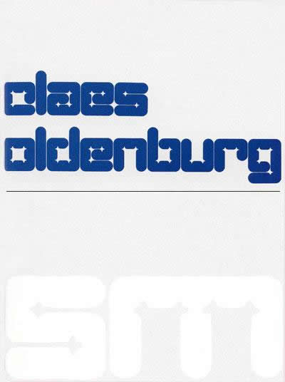
Claes Oldenburg Catalogue [fig. 2]
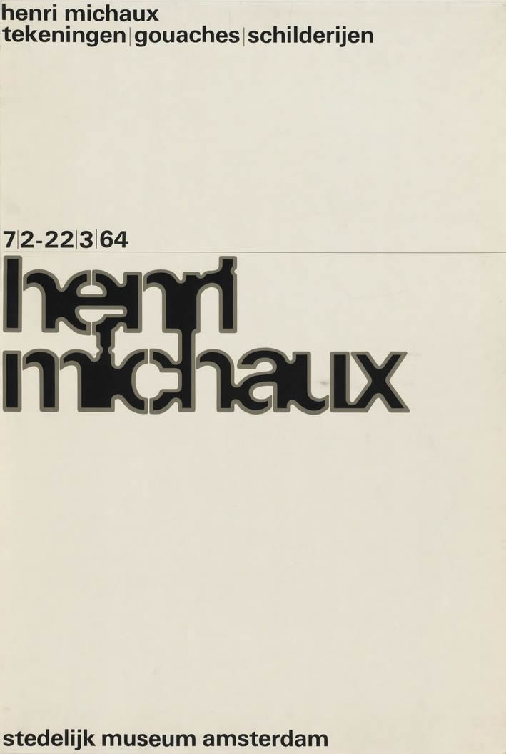
Henri Michaux Poster [fig. 3]
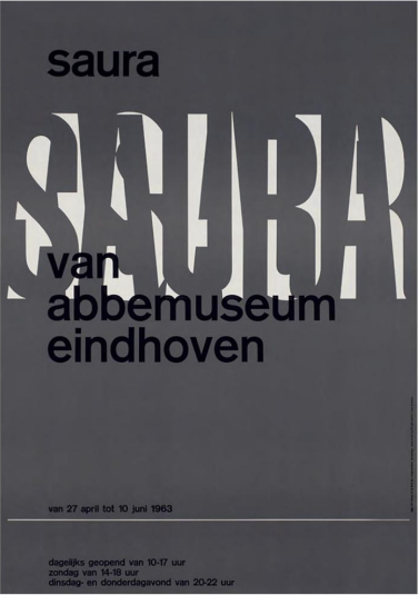
Antonio Saura Poster [fig. 4]
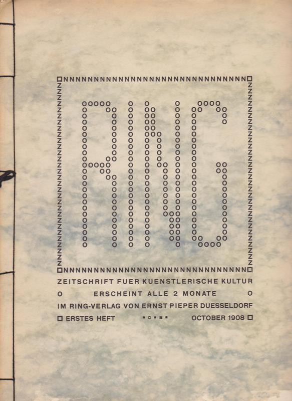
J.L.M. Lauweriks The Ring magazine [fig. 5]
J.L.M. Lauweriks Letterforms [fig. 6]
New Alphabet [fig. 7]
Kwadraat-Blad astronaut [fig. 8]
Atoms
An imaginary museum in black and white: ninety-six images in an identical square format, juxtaposed and arranged in four successive series. They accompany "Type Design in the Computer Age," an article published by Wim Crouwel in 1970. The illustrations, carefully devised by the author, eloquently express the issue being addressed[1]. Atomic structures, modern modular architecture, Op art, electronic images, and pictures of the conquest of space are set beside letters, words, and typefaces].
A few plates from Luca Pacioli's De Divine Proportione, showing the process of elaborating letterforms from geometric figures, point up the constructive model that has prevailed in type design ever since the early days of printing[2]. Crouwel's imagistic mélange underscores this historical constant and stresses the universality of certain principles by evoking many different realms (as confirmed by the reproduction of Leonardo's drawing of the Vitruvian Man). Since the infinitely large is placed alongside the infinitely small, the reader is often unable to distinguish the scale on which the illustration should be mentally represented: we cannot tell whether a given system of notched parallepipeds set perpendicular to one another is a housing project (the pride of modern architecture) seen from an airplane or the contents of a box of Lego blithely spread across the living-room carpet.
"The memory of a computer is an assembly of cells... so similar to the composition of organisms and to the structure of the entire society that it might serve as the point of departure for the development of numerous typefaces", wrote Crouwel, also noting that current forms of writing were threatened with anachronism[3]. Letterforms should reflect the state of arts and sciences of the day, whereas the classic elegance of serifs, like the ascenders and descenders of a sixteenth-century A or R, are poorly suited to today's environment. That is what the visual part of the article demonstrated, thanks to juxtapositions that made this stylistic time-warp clear and, conversely, revealed other, felicitous relationships.
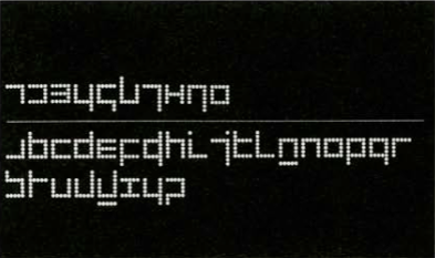
Thus the thin, straight lines of the New Alphabet designed by Crouwel between 1964 and 1967, the thick lettering on his 1968 poster Vormgevers [fig. 1] (which appear indissociable from the grid it is derived from), and also the outcome of experiments - again, devoid of the least curve - by two Englishmen, Timothy Epps and Christopher Evans[4], all appear fully harmonious with the technological ambiance that dominated the proposed selection. This harmony was based on orthogonal axes, the use of elementary forms, and the absence of ornamentation.
Univers(e)
Described thus, Crouwel's agenda recalled avant-garde precepts, and his assertion that "writing by hand is fortunately a vanishing skill" and that, "for true communicative purposes, its role is finished,"[5] seemed like an extension of Jan Tschichold's declarations regarding New Typography, namely that handwriting should be abandoned in favor of mechanical methods of composition[6]. Designed for cathode-tube ray display, Crouwel's New Alphabet was rightly described as typography's most recent attempt to establish a correlation between production technique and output,. That the shapes of his letterforms had nothing to do with any machine, and were the result of long hours spent over a sheet of paper during a period of several years, was not the least of the paradoxes[8].
Although based on values of functionalism and rational creativity, it was probably one of the specificities of his oeuvre to employ unexpected methods and to be constantly spurred by an experimental thrust, by a radical, inventive, and fanciful drive that dodged unequivocal definition whatever the sector concerned. Indeed, Crouwel practiced his trade in a wide-ranging fashion, beginning in the 1950s with exhibition design (which he never completely abandoned, and to which he has recently returned more regularly), then working as a graphic designer (both independently and as a founding partner of Total Design). Clearly expressed in the name its partners gave it, the ambition of the Total Design agency, founded in Amsterdam in 1963 on modernist principles, was to respond to everything, to provide solutions to all types of problems from the simplest to the most complex, in all kinds of contexts - corporate as well as cultural, private as well as public, in the Netherlands as well as abroad. Perfectly adapted to this desire for ubiquitous presence given its unlimited adaptability, the Univers typeface designed by Adrian Frutiger was therefore adopted by Total Design for its overall output[9].
Crouwel himself - whose Swiss friends had introduced him to Akziidenz Grotesk, which he had used as best he could, depending on the availability of fonts in the Dutch market - also opted for Univers. This typeface became a constant feature of his museum posters and catalogues, which represented a major aspect of his creative work over four decades, until he himself became director of the Boijmans van Beuningen Museum in Rotterdam in 1985, abandoning the job of graphic designer for the role of commissioning client.
Form
In Crouwel's museum work, typographic simplification was applied to the inner pages of publications and to secondary information on posters, whereas in both cases the actual title of an event would call for specific typographic creativity, all the more important in so far as no illustrations were used to evoke the content of exhibitions until the mid 1970s (with rare exceptions). In addition to the New Alphabet (which retained its original name) and the electric-typewriter lettertforms initially commissioned by Olivetti (which became Gridnik)"[10], during that period Crouwel designed three typefaces that were only released some twenty or thirty years later; in each case this release required further development of something originally designed for a strictly specific use. Thus Stedelijk was based on the Vormgevers poster, Fodor on covers for catalogues designed for the Museum Fodor from 1973 to 1977, and Catalogue on the typeface designed for the Claes Oldenburg [fig. 2] exhibition in 1970[11].
Several different aesthetics coexist within Crouwel's oeuvre, but it would be pointless to try to make each one coincide with the world of the specific artist featured in the posters and publications he designed. Indeed, despite Crouwel’s constant attention to artists' work and to potential relations between their work and his graphic design of titles (relations that remain un-decipherable to anyone ignorant of their genesis)[12], his style retained its own clear autonomy. What is noticeable is his acquaintance with several major trends of the latter half of the twentieth century, such as geometric abstraction. minimal art, and Pop art. The success of the emphatic Oldenburg typeface is due to Crouwel’s special interest in the American artist's work and the larger context in which it emerged[13].
Used on the cover of the catalogue. The letterforms appeared twice: blue on white in the upper part, and then in relief, white on white, in the initials of the museum embossed in the lower part, offering a tactile version of their bulbous lines. Equally "Pop" were the green and blue hues and the comic-book balloon in the middle of the poster for Lucht/Kunst, the inflated pink and red letterforms for Visuele Communicatie Nederland, and the more compact ones for Jeep Wegemeker. Quite distinct from these curves, which might make it a graphic equivalent of minimal art, the rectilinear New Alphabet was designed for the seeing of long strips of text with vertical as well as horizontal regularity, and to offer a reading experience based on an original visual composition. And should we seek further correlations, the liquid letterforms of Henri Michaux [fig.3] and the airy ones of Lucht/Kunst which, indifferent to their original shapes, come together to form new, unexpected units, provide a good example of a transposition of antiform into the register of writing.
Pointing out such connections underscores a certain complicity between the experiments of a graphic designer and those of the artists of his day. which is less frequent than might be expected. This interplay of convergences, however, does not do complete justice to the originality of an approach that occasionally seems to contradict Crouwel’s own credo: for example, he stated that, when working with museums "the designer has to take great pains not to project his own story or image," which, he added, meant respecting typographic principles little conducive to lavish variation[14]. Yet what are Crouwel's own posters and covers if not magnificent variations that come across as clear statements of his own positions? That they opt for an abstract quality and reject expressivity does not make them any less personal, and does not prevent clashes with the work of certain artists. Take the poster for Antonio Saura [fig.4]: two colors and the simple yet skillful superimposition of the word SAURA over the lighter ground constituted by its barely modified twin, ASAUR; the stark opposition to the exuberant lines of Saute's figurative painting was striking, whereas the legibility-which Crouwel claimed was paramount[15] - was so compromised that another "Saura," this time in lineal face, had to be set above the title.
Clarity
The layout of a catalogue probably fulfils in clearest fashion the principles of "good design" - effective and meticulous - that Crouwel learned from his Swiss mentors. Governed by the idea of a series or imprint that employed uniform format, typeface, and organization of content, the publications he designed for the Van Abbe Museum from 1956 to 1963, then for the Stedelijk Museum from the early 1960s onward, and also for the Museum Fodor in the mid 1970s, came across as unspectacular objects. They were little brochures produced with limited resources. Basic information - a biography of the artist, a bibliography, a list of works on show - was accompanied by illustrations, usually limited in number, whose order of reproduction was defined according to objective criteria (usually chronological) rather than the search for any given effect. In this austere context, shaped photos of certain sculptures - occasionally spread over two pages - constituted visual luxury. The overall soberness did not exclude a few particularities: blocks of texts dictated by the shape of the artist's bronzes in Tajiri ; the occasionally shimmering presence of interleaves of colored glassine (lemon yellow and brown for De Verzameling, bright yellow for Edgar Fernhout, petrol blue for Brusselmans); a first page identical to the cover (same color, same weight) in Arman; the impression of totality in Lucht/Kunst generated by a white-to-blue tonal progression, including (black and white) illustrations; the need to rotate the book by 90° to read Jaap Wagemaker. Yet their salient character, so to speak, derived above all from something that is not usually noticed, which publishing too often overlooks, but which Crouwel handled with extreme subtlety - the scholarly apparatus of the book, organized through a perfectly ruled page layout into rows and columns of stunning clarity. This virtuoso exercise was achieved with limited means: a single typeface (employed in a single point-size plus two bolds). a parsimonious utilization of upper-case letters, and use of rules. The situation was somewhat different with the series of catalogues for the Museum Fodor, often just four pages long. Thanks to a shrewd set of guidelines, Crouwel transformed tight budgetary constraints into a strong image for his client. A fixed cover design placed more emphasis on institutional continuity than on programming diversity; composed of "pixelated” lettering discreetly echoed by the screen of tiny dots covering the page, the name of the museum (printed in pink on red) and the number of the publication (in black, in larger type) constituted the main information. The title of the show, in the same typewriter face used inside - a house version of Univers - appeared secondary.
History
Objectivity and legibility, the two pillars of applied modernism that Crouwel mentioned here and there in his rhetoric, were nevertheless regularly manhandled by the designer. Although he suggested throwing handwritten letters out the window, he also advocated a more individualized education that entailed learning not to form an "a" but to understand the characteristics of "a" in order to write it according to one's own scriptural inclinations[16]. Alongside the major graphic sources cited in order to place his own letterform experiments within an historical continuity - Kurt Schwitters, Herbert Bayer, Van Doesburg, and others - Crouwel did not disdain vernacular allusions and recalled the modular concerns of inscriptions done on tile rooftops and brick constructions[17]. With great autobiographical subjectivity, he compared the digital composition techniques of his early career to the lettered samplers that his grandmother embroidered on woven fabric, imprisoned in a rigid grid that was incompatible with the letterforms she was trying to produce. To judge by the photograph that accompanies this passage, his forebear managed pretty well despite the added difficulty of choosing decoratively scrolled letters that imitated handwriting with a fountain pen[18].
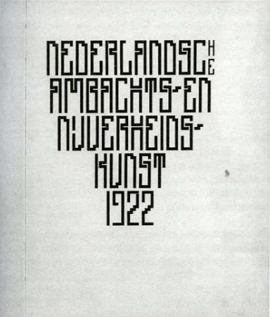
This story reminds me of my own family, evoking an image of the grandfather whom I never knew but whose needlework has survived. An eccentric intellectual, he did embroidery in his spare time and notably made, probably in the 1920s or 1930s, a typographical tableau of the names of his favorite writers set against a colorful diamond-patterned ground. He made no attempt to render the curves, so the appearance of his stepped letters, despite their serifs, was similar to geometric-style typefaces, and today would merit the adjective "pixelated." It is moreover striking to note the existence of this type of lettering right from the early twentieth century - in the Netherlands alone, we need merely think of the architectured letterforms designed by Hendrik Wijdeveld in the 1920s for the periodical Wendingen, and more particularly of devised in 1908-1909 by his compatriot J.L.M. Lauweriks [fig. 5, fig. 6], then working in Stuttgart, for the cover of the magazine The Ring [fig. 5] - they were composed of rings and are similar to Crouwel's lettering on the 1964 Job Hansen poster and certain dot-based sketches that eventually yielded the New Alphabet [fig. 7.].
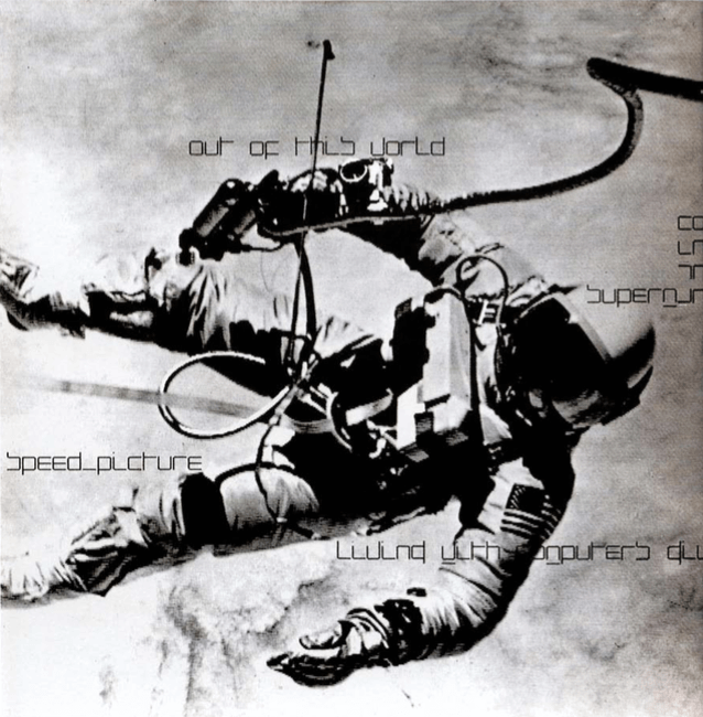
"We get used to everything. The once indispensable legibility has simply gone away," Crouwel observed[19]. And yet even today the New Alphabet has lost none of its effect of "strangeness," to use the term employed by the Russian Formalists to describe art's role of decontexualization and distanciation[20]. Nor have the letterforms created for his posters become common-place, nor have the effects of the various graphic inventions that mark his exceptional oeuvre lost their edge: every reading experience is a new occasion for making perception i.e. "automatic." The catalogues themselves, with pages laid out in lists and tableaus of rare elegance, now seem like UFOs in the realm of contemporary publishing. Pursuing the experiments undertaken by the avant-garde, anticipating those that would exploit electronic technology and blast a hole in typographic space, Crouwel’s oeuvre does not represent a finite chapter in the history of graphic design - rather, it appears to be weightless, like the Kwadraat-Blad astronaut [fig. 9] Speaking of the current erosion in forms of writing, Crouwel noted, "It's like the food they serve in airplanes, reheated a week later and eaten in a rainstorm. But no-one complains and we don't have any difficulty reading it.[21]“
We could also decide not to swallow such sodden affronts. We could rebel. And thereby confirm, day by day, the reinvigorating virtues of the New Alphabet.
Notes
1 Wim Crouwel, ''Type Design for the Computer Age", Journal of Typographic Research (1970), vol. 4, no. 1, p. 51-59.
2 Luca Pacioli, De Divina Proportione (Venice, 1509); Divine Proportion (Norwalk. Conn: Abaris Books, 2007).
3 Crouwel, "Type Design..,”
4 Timothy Epps and Christopher Evans. Alphabet, Kwadraat Blad ( Hilversum, De Jong & Co., 1970).
5 Crouwel, "Type Design..,”
6 Jan Tschichold, The New Typography (1928), translated by Roan McLean (Berkeley: University of California Press, 1998), p. 64-79.
7 Evert Bloemsma, "Balance. Avance, Cocon", in Van Rixtel and Westerveld (eds.), Letters (Eindhoven: 2001), 77 quoted in Jan Middendorp, "Wim Crouwel and Dutch Calvinism", Dutch Type (Rotterdam: 010 Publishers. 2004), p.121.
8 On the process of designing the New Alphabet, see the well-documented book edited by Paolo Palma, New Alphabet: Wim Crouwel e la tipgrafia sperimentale (self-publication, 2003).
9 In 1985 Total Design's Daphne Duijvelshoff-van Peski notably designed the visual image of the Capc Museum in Bordeaux, whose punning signature at the time was "The Universe is our Logo".
10 Commissioned by Olivetti in 1974, this typeface was never released due to the rapid obsolescence of electric typewriters upon the arrival of computers.
11 The Foundry, London, distributes the following typefaces: New Alphabet, Stedelijk, Fodor, Gridnik (1997) and Catalogue (2003).
12 On Crouwel's interpretation of the work of artists on the various exhibition posters he has designed, see in particular David Quay (ed.), Wim Crouwel Alphabets (Amsterdam, Bis Publishers, 2003).
13 Oldenburg asked Crouwel for a complete version of the alphabet, which the latter produced in letters cut from pink paper.
14 Wim Crouwel, "Designing for a Museum", initially published in Dutch in Wim Crouwel (ed.), Om de Kunst (Eindhoven: Lecturis, 1978). Forthcoming (late 2007) in a book published by Alliance Graphique Internationale (AGI).
15 Ibid.
16 Wim Crouwel, "A Proposition for Education in Letterforms and Handwriting", Visible Language (Summer 1974 ). vol. 8, no. 3, p.261-264.
17 WIim Crouwel, ”Regarder, apprendre, savoir…douter", Etapes 33 (December 1996), p. 35.
18 Ibid.
19 Ibid.
20 See Victor Shklovsky, "Art as Technique" in L.T. Lemon & M.J. Reis (eds.), Russian Formalist Criticism, ( Lincoln: Univ. of Nebraska Press, 1965). p. 3-23, and Carlo Ginzburg, "Making Things Strange: The Prehistory of a Literary Device", Representations 56, Special Issue: The New Erudition (Autumn 1996), p.8-28.
21 Crouwel, "Regarder...," p. 36.