
‘Since the new alphabet’
New Alphabet 1967
It is a long time ago, my new alphabet: 1967 was the year of publication. In thirty years a lot has changed and is even difficult to recollect the motives why I ever designed it. Looking back it seems ridiculous. Basically I experimented with type and words already from 1955 onwards. I was intrigued both by the structural experiments of the De Stijl movements and by the purifying direction of the later Bauhaus in Dessau. In the sixties I became highly interested in visual structuralism, something that was in the air.
To me it resulted from working along typographic grids and trying to find the ultimate consequences of structuralism. Learning from architecture, I imagined a book or publication as a 3 dimensional product, where each position stood in a specific relation to any other position. A book is not a sum of single pages or double spreads, but a three-dimensional object. For a lecture I prepared in that period, I made special slides visualising my point of view; some of those I still keep as some sort of nostalgic token. Even type can be looked upon as a 3 dimensional object. All this occurred to me, with a vague notion of the bit-sphere in computers; I really didn't know too much about it.
In 1966, at the DRUPA[1] in Dasseldorf, the annual exhibition on print and paper, I attended the launch of 'Digisett', the first electronic typesetter by Hell.
Observing the results of this machine, and thinking about the way type was reproduced here, I became highly intrigued by this bit-technique. Typefaces drawn by hand and engraved in metal; then carted in an alloy of lead and softened by the many times it was used, had a very specific character and flavour. And here we saw a reproduction of that process, via the electronic brain of this machine, build up in little dots within a rigid grid.
It used more or less the principle of the old Jacquard textile machines, where each pattern is translated in a square grid and punched in a band of cardboard for reproduction. I saw the resemblance with the typefaces my grandmother embroided in little cross stiches on her embroidery canvas. From Kurt Weidemann I saw around this time his beautiful collection of 19th century text-canvasses. All in all I became very interested in all sorts of modular techniques to reproduce typefaces, such as through bricklaying and through tiles. I made many slides for my collection. It all fitted in my fascination for the cellular world; for that visual structuralism. Also an early book on the subject of computer typesetting, published in 1966, made me aware of the many difficulties that still had to be overcome.
Typefaces, reproduced by the Hell Digiset tried to look like century-old faces, but failed to do that as regards to those specIfic characteristics I mentioned before. If you studied the digital products through the magnifying glass, something odd could be seen. Small sizes, compared to bigger sizes, seemed all different; especially round shapes changed into completely different silhouettes. Only straight lines kept their form. The whole complex of visual contradictions, and the conflict between old conventions and new techniques, convinced me that possibly a time had arrived for different way of thinking. Possibly even a new typeface-system.This is how l arrived at my experiments. First all sorts of trials and experiments. After some time the offer to publish the results in the ‘Quarterprints' of Pieter Brattinga.
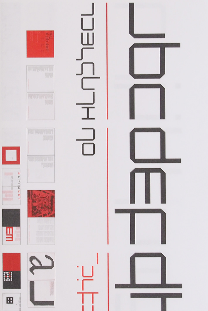
I decided that my typeface had to be constructed from straight lines and 45 degrees corners. Following my interest in the 3-dimensionality of the book, all letters should have an even width, whereby spacing between words should always be related to the width of an individual character. Caps are indicated by a line on top of the character and 'double' characters such as the 'm' or 'w' are formed by a line through the single 'n' and ‘v’. In this way a text not only has horizontal accentuation but also a regular vertical pattern. It is clear that it needs some training to read it! To me it was also clear that the typeface was not fit for use, but that it was designed for the sake of discussion. Furthermore, I gave an example of integration of type and illustration. Digital thinking included this, in my opinion; we should do away with separate blocks for text and illustration. I was convinced — from the beginning—that my experiments could never tear down the barriers of conventions that guarded over the existing typeface tradition. One cannot simply bend an age-old development. Still, I thought it must be possible to start a sensible discussion on how to face the new, and revolutionary, electronic developments.
Well of course the discussion was short and not very effective. Nevertheless I got my chance to make my point and today, thirty years later, I still receive letters and requests regarding this experiment. The 'New Alphabet' was mostly misunderstood as a face to be read by the machine, like the OCR-B[2] on cheques.
Most critics who reviewed New Alphabet never saw my explanatory text accompanying the publication, and interpreted it from what they saw. Nevertheless, I do not blame them, because that is the risk of every visual experiment In retrospect it was a fascinating period which directed my work for a certain period afterwards. From there on I did for instance: posters with typefaces of similar nature; a symbol for Rotterdam; the logotype for Expo '70, the World's Fair in Osaka; a typeface for a series of museum catalogues; a typeface for an Olivetti-typewriter that never came on the market); a soft alphabet on request of Claes Oldenburg. And finally a postage stamp for the Dutch Postal Services. I collected all these results for an exhibition in the Stedelijk Museum in 1978, accompanied by a catalogue-leaflet that was almost unreadable since I tried to integrate text and illustrations.
This was 1967. From that point in time a real revolution took place. Now type is a hype! Never before such an eruption of typeface-creativity has been seen. And all resulting from that magical digital thing, that miniaturizes by the day, and can be handled by almost everyone. The clicking mouse is running over his foampad. Before computer typesetting came into existence, one could count the international league of typedesigners at the fingers of two hands. Today, alone in Netherlands, the same number flourishes.
Strange is the fact that, while during the fifties and sixties much research was dedicated to the readability of type and typography, nowadays we don't hear anything about such research anymore. Also in this conference[3] nothing is heard about readability research. It is obviously outmoded! In the early days we were constantly kept informed about the results of tests with eyemarkers on individuals and groups; on reading-tests and text-recognition. It looked like an ongoing soap about the preference of type with and without serifs. Names like Zachrisson, Ovink, Tinker, Spencer, Vartabedian, Foster and Wendt were familiar in typeface and typography circles. Always there was that everlasting confusion between display and booktype. And, of course, there was always someone who took a point of view regarding the origin of type; was it writing or something else. Moving was the fight in words between the conservative Didot lovers and the modernist metrical promotors.
Well: the computer made the Didotpoints old fashioned. But what about readability? Did we finally reach the conclusion that the results of research added nothing to the profession? Or have we been overwhelmed by the uncheckable flood of type, and things we do with them? The production of print is increasing all the time. New machines for transmission of the printed word have been invented, as well as new machines for copying. A new era came in which almost everything is copied, over-copied, and digitally relayed by way of satellites. And upon arrival becomes copied again for fax-distribution. The final result often resembles a reheated week-old portion of airplane food, to be eaten in a pouring rainshower. And nobody protests for we have no problem in reading it. We accommodated ourselves completely. The need for readability research just faded away.
At the same time a large amount of new typefaces came over us. Many are based on classic types and classic conventions, but seldom they are better. Others are fun-characters from the pop-scene where the approach is much more free. Just as I saw in my dream in 1967, type and illustration have melted together in overall images. True enough: not based on the same principles, but nevertheless integrated. The influence of the autonomous two dimensional art is clearly visible. Text is no longer in the first place to be read, but first of all adds to the experience of the message. And the message is short-lived: it is there to zap-up, glance at it, and push away. Out of many images, one overall image is created by turning the pages of the magazines, switching the channels, or surfing the world wide web.
It seems that the final thing is getting high and feeling richer. Is it worthwhile designing new typefaces when they are used in this secondary way; where any given typeface would do? I do not know, but it looks like it is, given the keenness of the whole existing army of typeface-designers.
Type and typographic design are strange professions. On one hand we find the so called serious boys and girls who smoothen traditional typefaces to such a degree that they hopefully become children of their time. What is seen as an upgrading process, unfortunately often ends in a degrading affair. But how they love the endless shaving of curves and lines of alphabet number 1001! Hermits and idealists who, through almost invisible work, try to defend and protect our cultural heritage. With high morale they follow the evolution of age-old conventions. Their typography is classical, tending to symmetry; to the quiet, well balanced page. Is this old stuff? Nothing new? What's new really? Everything that is well proven in time: is new.
On the other hand there are the fashionable cultdriyers. Nonconformists; cuffing and glueing with the Mac. More in tune with popculture than tradition. They love the experiment wIth the past. Real children of the post-modernists. Products of the past are at hand to reshape, combine and mix for short lived print. Tradition is dull; only the look of tradition is brand new! Moral questions are questionable. One uses what is available; and scanner and mouse to do mighty good jobs. Their alphabets cry, protest or drop tears. Such is life!
A world of differences, un-bridgeable. At best one tolerates each other in the knowledge that they are all products of this time. They all have their teachers and their heroes. And just like in the sixties there is that confusion and discussion on who is right and wrong. And who has the strongest arguments, forgetting that none of them has a strong position at all. In fact the discussion is a non-discussion if we look at it in a realistic perspective. Both camps represent high-culture, narrow ends of a wide wavelength that contains 99% popular rubbish and grey non-typography. With all our efforts in this age of renewal and innovation: the bulk of the visible output reaches below zero.
This proves that we need each other, and that all the differences of opinion and culture are in fact linked tightly. The situation looks like a rainbow, where red and violet are parameters, but at the same time, are closely related colors as well. Both sides of the wavelength are equally involved in modern developments, the computer is their ultimate tool: nobody can do without it. Either they use it discretely, finding the right shape of a new typeface or the proper balance on the typographical page. Or they use it extravagantly to process overwhelming imagery on magazine pages, with their ever-new typeface inventions.
The first group of users try not to show the use of the electronic tool, but they can't help that modern type and typography are clearly different from that of the metal type period. But readability is still their first aim. The second group is fond of modem means, and love to show-off with it. They explore all the wonders of the screen and if possible all at the same time, in the same job. One must often conclude that their main concern is not reading.
This year I was heading a committee to review the Dutch art schools. One of our findings was that in graphic design by far the largest number of students was interested in visual imagery and only a small number was dedicated to type and typography for reading purpose. This makes me wonder in what direction we are heading. I don't know the answer and I will not crIticize any of the developments, because — even if you don't understand the feeling or the drive of much of the work—l am intrigued, sometimes even impressed by what I see. Jealous I get when I see with what ease these illusionists are making their images, confident of the need to communicate in this way.
One thing is clear however, the world of graphic designers, type designers and typographers is definitively divided into camps; in spheres of functions, The information side that cannot do without reading, and the ode where the image takes command and reading is a by-product.
This development implicates to my opinion, the need for a whole new approach in teaching. In the Netherlands the art schools went through a kind of liberation period. The need to break through the dogma's and methods of the Bauhaus-system, called for a new type of school where the personal — unhindered — creative development of the student became the centerpoint of attention. At the same time the various disciplines lost their clarity. The influence of autonomous art was to a great deal determining the direction the disciplines went into. One tried to do away with the traditional barriers between departments, although this never really became successful. For students the result is often a vague notion of future possibilities and many chances of failure as young professionals. Also in art schools there exists a tendency towards overlap between the traditional disciplines. Graphic designers do 3-dimensional work, interior designers do industrial design and industrial designers go into site-design for Internet. More and more multi-disciplinary studios come into existence. It is my opinion that, in spite of the integration of disciplines, the training of designers should not pursue this tendency further. The results are now to be seen at Dutch art schools. A general training with only a slight tendency for some sort of specialisation is not the answer for the future profession.
I think it is time to make clearer decisions.The system needs a fresh, new direction of thinking.
Art schools started in the 17th century as schools for drawing. In the 19th century under the influence of the South Kensington system, the applied arts entered the schools. The Arts and Crafts movement gave it a new impetus, until the Bauhaus brought us the general ‘Vorkurs’ and the specializations. We entered modern times with an idealistic view on society. In the seventies we elevated the personal — unhindered — development of the student to the centre of the curriculum, and liberated the system from dogma's and a strong division between disciplines. Now, 25 years after these last principal changes, it seems time to renew the curriculum again. As !said: we need a fresh, new direction of thinking.
In my view there's a need for a relatively short period of general input, followed by a flexible range of specializations, offered in a modular model. Within this range, the traditional discipline of type design, as well as the modern multi-media direction can be found. Such a flexible system is better suited to keep in touch with the revolutionary developments of today, where a whole new series of specializations form the basis for the new interdisciplinary direction of our profession.
Ladies and Gentlemen, an experiment in my younger years brought me the chance to elaborate on recent developments in our intriguing profession. It is impossible to speak about type, without touching typography and the whole field of related subjects. The most Important thing is that we keep our wide range radar turning and prevent ourselves from narrow professional ideotism. Let me finish with the beginning of the introduction. Much to my surprise I discovered my New Alphabet in Blah Blah Blah[4], be it somewhat improved for readability! Oh what a wonderful world.
Notes
1 Fachmesse für Druck und Papier
2 The OCR-B is a set of monospace font developed in 1968 by Adrian Frutiger for Monotype by following the European Computer Manufacturer's Association standard. Its function was to facilitate the optical character recognition operations by electronic devices.
3 A-Typi The Hague, 24-28 October 1996
4 Blahl Blah Blah is an entertainment magazine from Reading, England