
1928: beauty and lucidity, logic and ingenuity
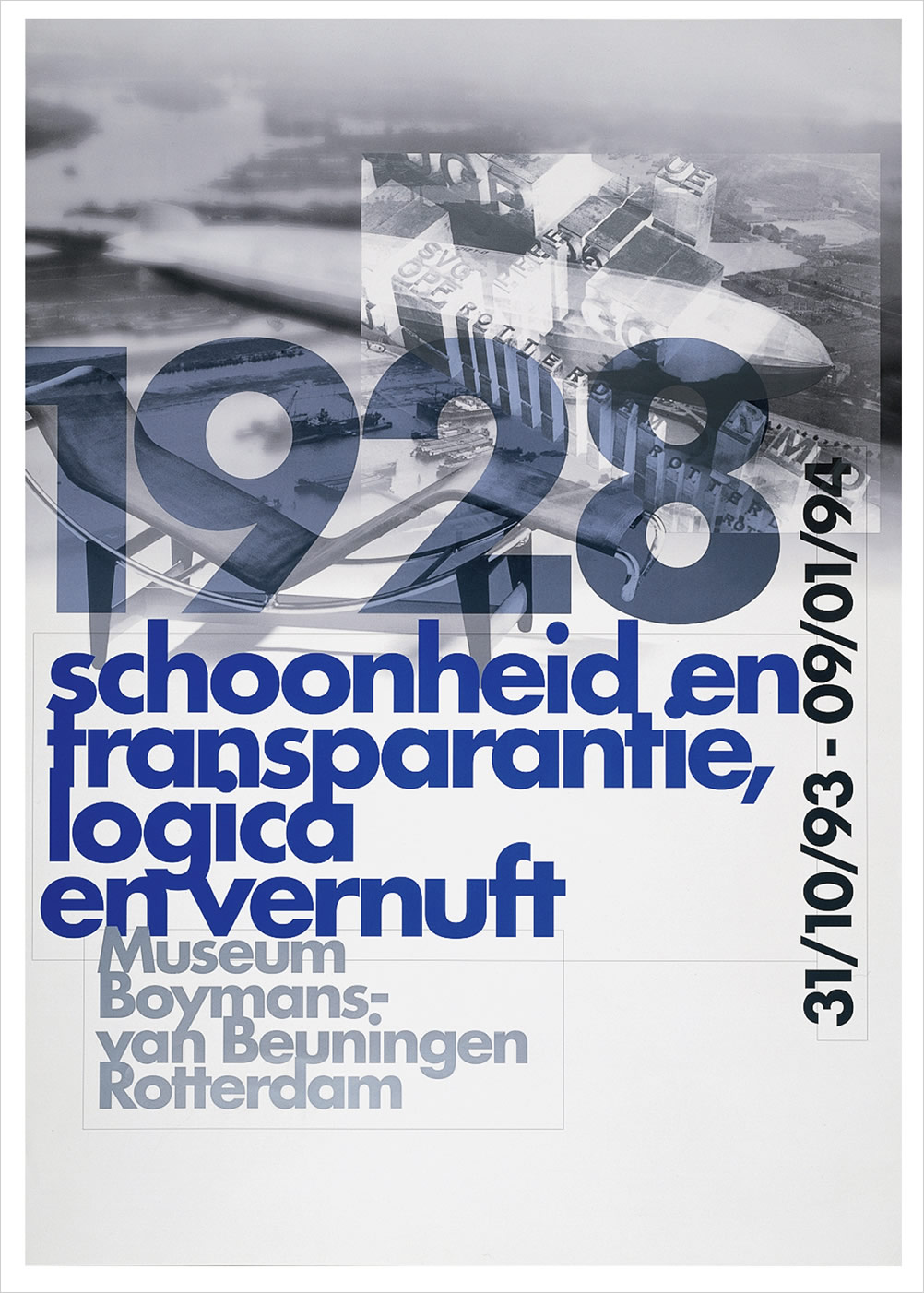
Museum Boymans-van Beuningen, Rotterdam.'1928: schoonheid en transparantie, logica en vernuft', poster, design: 8vo, 1993
In 1993, when I retired from the Boijmans van Beuningen Museum, where I had been director for 8 years, I made an exhibition on the modernist period. I took the year of my birth and selected the most specific objects of that year. Bugatti made his most competitive car ever and the silver Hindenburg sailed around the world. This was the world I always saw before me.
In 1928 the Bauhaus had moved to Dessau where Gropius built that lucid glass school building (and the exemplary Meisterhauser) the first chromed steel furniture was introduced by Mart Stam, Marcel Breuer and Mies van der Rohe
• Paul Renner created the constructive Future typeface
• Le Corbusier designed his most interesting architecture and his famous steel furniture (in cooperation with Charlotte Perriand)
• in Holland the revolutionary Van Nelle factory and the Zonnestraal sanatorium were built.
This social movement (modernism) with its uncompromsing clarity, lucidity, logic and ingenuity — even if it was sometimes unrealistic utopian — was an experience I dreamt about. It gave a basic direction to my aspirations.
modernism in typography and graphic design
I leared my profession during the letterpress era, managed in the sixties to overcome the transition to offset printing and was struggling to feel myself at ease with mouse and screen when they appeared. But since one is never too old to learn, I make use of the opportunity to explain some of my personal and critical remarks on the development of our discipline. I also would like to see whether the basic principles in typography and graphic design, which were highly decisive in my career, are still valid.To find out I will travel up and down between the past and today.
I would like to make clear that if I talk about graphic design and typography, I talk about that relatively small part of the profession in which advanced and critical thinking is involved. I do not mean the massive load of print that everyday sweeps over our world.
modernism; its spirit
My generation grew up in the spirit of modernism. We studied at art school at the end of the forties, the period that the Second World War had lust ended. It was a time of rebuilding the shatters of five devastating years. There was a great belief in a new future — and — just like during the aftermath of the First World War, architects and designers thought they could help to create a better world. Although our means and tools found their origins in the twenties and thirties, at schools like the Bauhaus, we cleansed them from all expressionistic touches and used them in a much more rational way: undo everything that was superfluous. In my days graphic design was in all aspects seen as a cleansing job which should not tell its own story. For us the fifties were most promising: there were not that many clients, but we felt indispensable anyway!
today's developments
Today this all seems a far away past. If I look at the results of current design practice — even that relatively small part where advanced thinking seems involved — it is with great curiosity. These feelings are absolutely related to all the changes in society; design is always highly influenced by these changes. Design has, in general, always been a mirror-image of society. It is clear that modern society is complex and even within this complexity a constant change exists. It is obvious that graphic design is following all these changes, for better or worse. 'Complexity' is a key-word which fits the current situation of graphic design perfectly. It is my impression that graphic designers today love this complexity and try hard to express it, in their work. Never before we have experienced so much multi-layered work; be it in a single image, a magazine, in a book or in digital format. One piece of graphic design often has different meanings, a book design hides many messages. Messages are multi-interpretable. I observe these trends with much curiosity. They began some decades ago.
postmodernism
Ever since the miracles of post-modernist theory came over us, I often fell into a state of great uncertainty. Post-modernism, at the end of the 20th century, is highly eclectic.
One of the first signs of uprising against the achievements of Modernism and simplicity was the publication of 'Complexity and Contradiction in Architecture' written by architects Venturi and Scott Brown in 1966. It was a kind of eclectic compendium of visual examples highlighting the quality of visual complexity and contradictions. In 1972 they published 'Learning from Las Vegas' in which they reflect on popular culture and commercial architecture and its influence on contemporary architecture and design. It also had much influence on disciplines outside architecture, such as graphic design. In short, it re-introduced and worshipped eclecticism in architecture and design. Everything Modernism had brought us, which we assumed basic and of major Importance to our work, was turned into ridicule. No more idealism, no more inspiring guidelines; to me it was just a sort of materialistic pragmatism based on historic examples and supported by a heavy load of theory. Post-Modernism as it was interpreted in architecture and design, gave us free pick and steal from all the cultural achievements of our past.
There exists a certain contradiction in terms in this way of thinking: looking backwards into history in order to make progress. Somewhat like looking down to get higher up. It was the beginning of a great lack of attention for moral questions, about what is 'done or not done'. Even a return to traditional rules was a legitimate part of the game. As for traditional symmetrical typography and design, that had already long ago turned into hollow schemes without meaning, with unbreakable rules and regulations: it was simply re-invented as a recipe for many visual problems. In this respect, this recovery of tradition reminds me of a famous line by the writer Aldous Huxley: 'Tradition is the best substitute for talent'.
But let me return to the current situation; the late-post-modern, or if you like, the past-post-modern era. One could say, apart from a temporary economic slow down, it is prime-time for graphic design. We live in a high-spirited period, where all changes are accelerating graphic design activity. Its alive and kicking. As I said before, designers accept the complexity, that comes with it, with open arms. Wolfgang Weingart's typographical de-constructions paved the way. David Carson's 'Ray Gun' magazine, with its outstretched, lacerated and layering Illustrations and text columns, was one of the ultimate examples. Even this week I received a brand new, Dutch published, magazine carrying the name 'Currency'. Under the heading It explains: convey a state of being widely known/a container about survival/ a vast pocket/ an unlit place/ discarded private and public muck etcetera. For me it is difficult to find out, from the fragmented content and the secret formulas, what 'Currency' is about But somewhere there must be an understanding audience for it. Obviously there is little desire to find solutions to unravel complexity; to provide individuals with a tool to obtain a clear view on the underlying structures and content. I must come to the conclusion that such views, as inspiring starting points for graphic design, are obviously no longer of primary interest. Graphic design not only became the expression of an ever changing daily situation; It delivered the opportunity for change in itself.Tomorrows design must be different from that of today, in order to survive. As a consequence there is a greater need for ideas than for formal visions and structure. It seems there is no need for old rules and principles.
Is this bad? I do not know. But I am often suspicious about fast changing superficial fashions, small eclectic neo-styles, big atmospheric collage books: all that complex imagery. It all comes awfully close to life-style-styling. Style only has brought new combinations; it has never put forward great ideas. Once a certain Stewart Ewen said: 'style is something to be used up. Part of its significance is, that it will lose its significance: And rightly so. I am sure that designers of this generation look different at their own work than I dd. They don't carry the burden of too much old philosophy (one cannot blame most designers of too much historical knowledge). They don't have to struggle with principles of Modernism that have never crossed their mind. Instead: they know the visual codes of modem life. Crossing borders to other disciplines, so popular today, offer them a of of new possibilities. All the tensions of today create a great challenge, there is so much going on; it is one great drugged dance party. Why should they bother? They have an open mind. And everything goes! But; even helped by my strong belief in the future, I sometimes have the greatest problems in understanding their drive. What makes them click?
what was the purpose of our work?
As I said before, I think that graphic design is first of all a means to create a clear view in a complex and chaotic world. It should be a straightforward strong visual translation of messages and never an expression in it's own right. It should show you the way. The message should never be buried under the form it receives from the designer. Creating order was our main objective. Just like architecture and other design disciplines, graphic design should delivers social service, work for the public good. Those were the principles and that is where our main interest headed. That it didn't always work out as we hoped, is a different chapter of the story.
Ever since the first signs of the 20th century modem movement appeared with constructivism, it was driven by an ideology which fostered a great believe in a better world. In the realm of design this resulted in a search for work that served the community. During the second half of the century for example, interest grew in creating signage and symbols for international understanding. I remember when this subject appeared at the program of a conference of the International Council of Graphic Design Associations in 1963, a certain Mr. Bliss, who had developed the ultimate international graphic language, accused us — the designers — of not knowing his work. Under the title 'Semantography' or 'Bliss-symbolics' he created, as he wrote, a 'logical writing for an illogical world'. During his life-long research, published in an extensive book, he invented all the necessary symbols for a visual language which assists easier understanding. Regrettably it was presented at a time during which designers were less interested in how things were done, but more interested in why things were done. The development of this conception of design also brought fascinating typographical statements and solutions. For instance the single use of lower case typography was not an aesthetic game, but resulted from a strong feeling for democratic equality. Caps belonged to an avoidable hierarchy. The rigid use of typographical grids and sans-serif type came from the need for structure, clarity and transparency. This was not a question of elegance, but of meaning. Graphic design was — so to speak — the choreography of what had to be said. And designers made the choreography come to life wth great passion; it should be spiritual and contain tension. The great masters of Modernism such as: Jan Tschichold, Herbert Bayer, Paul Renner, Piet Zwart, Moholy Nagy and others showed us how lucid the result could be and how sharp it reflected their time. In those days the word 'avantgarde' still possessed meaningful content.
the art scene
Today this all seems so irrelevant. As I said before, there is obviously a great need for artful complexity and redundant extravaganza in design. Even new-Helvetica-minimalism contains a double message. Sometimes I come to the conclusion that designers like acting much more than thinking. Typical for that situation is the turbulent inclination towards the experiment. Since the seventies the art schools in my country, have stressed the importance of personal freedom and experiment. And often the experiment for the sake of the experiment.The development of an independent point of view was of prime importance. Rules or principles were not accepted anymore. Learning the inns and outs of the discipline came second.
Of course this mentality brought a welcome and refreshing interruption after the deterioration of Modernism, when designers were repeating old models that did not function any more. A counter-movement was much needed.
The attitude of critical self-research, and the lucky fact that many cultural institutions were receptive for new ideas, made Dutch graphic design in the eighties and nineties internationally famous. But gradually the experiment became, in my observation, synonym for lust in form and self-expression through this form. In that sense design became more and more part of the visual arts scene. Typographical pages posed as precious pieces of art, creating curiosity instead of making a text readable. With Bruce Mau and Irma Boom books grew thicker and heavier, and ever more colorful. But these books are about books: l’art pour l'art. Like in the arts world, authenticity became a mark of quality. The tendency to equalize art and design grew. I myself think (although they live in each others neighbourhood) graphic design and typography are quite different from art. There is a question of responsibility in relation to the public and ourselves involved.
the macintosh
The peak of these wild developments came with the Apple Macintosh. This wonder-machine tremendously helped to open up new and wide perspectives. It brought the possibility to work in many complex layers at the same time. Software as the great miracle: 'copy' and 'enter' became the magic combination. Suddenly graphic design could look like stills from a video production. The computer is of course a blessing. Computerized typography for instance, can be much better than ever before. It gives a much better way of fine-tuning than could be done with the traditional techniques and it is more consistent. As a device to make things visible in a very short time it is indispensable; we have always had more dreams then could be realized by ourselves. Our productivity gained enormously. And as I said before: the computer created possibilities that we could not even dream off. But sometimes I long for a computer of a less slavish nature. An intelligent computer with a screen that tells you to re-think whenever you forget that graphic design is something else than playing around with elegant nice results. Desktop Publishing is not graphic design! Maybe, after all, creating ideas by means of pencil and paper was not that bad at all!!
new alphabet
I myself was so intrigued and blinded by the first, computerized typesetting in the sixties, that I thought it wise to create a specific typeface for it. A typeface that, much better than the old faces, fitted this new technique. Sometimes, while working on this project, I even thought: 'through the computer, design finally has become democratic'. The great German artist Joseph Beuys once proclaimed that 'in every human being, an artist resides'. In this arising vision of de-professionalism, some people in the seventies even stated that professional design was an anti-human discipline. That it ran across the inner, fundamental human wish for creative self-expression: man is not after clarity and order. In my country there even existed, for a short period, a true rebellious movement against architects and designers. With this all happening, one could not imagine a greater diversion from the original ideals of Modernism.
concluding
While looking at the (at first sight) flourishing situation we are in now, my critical observations remain alive. I am not pleading a return to the bare basic philosophy of the modern movement nor to its moral principles. That is 20th century past. Never look over your shoulders for a solution. We are in a different world now. But I am left with questions about principles, content and underlying structures of graphic design. As I said, I sometimes doubt whether these questions are still valid today. I for myself cannot stop to believe that graphic design is first of all a means of making things clear. To me that is its first rule. Creating complexity, curiosity and asking questions are another domain. In my opinion the most important guide is always the question: why are we doing what we are doing? It is all about our responsibility towards society.