
Bruno Monguzzi, Corot, (3 posters in triptych), 128 x 270 cm, 1994.
Creating the Poetry of Form and Function: A Discussion with Bruno Monguzzi
Franc Nunoo-Quarcoo: What is your definition of design?
Bruno Monguzzi: The intellectual and pragmatic process aimed at giving an appropriate form to a given function.
FN-Q: And what is your definition of typography?
BM: Typographic design is simply the vehicle through which words can be seen, read, and understood. Hopefully. And possibly memorized. This is what I had answered a couple of years ago to the editor of the Idea magazine special issue on typography. Ten years ago, for Ruedi Ruegg’s Basic Typography: Design with Letters, I had quoted Lissitzky: “Typographical design should perform optically what the speaker creates through voice and gesture for his thoughts,” mentioning that this assimilation of the work of the typographer with that of the orator seemed to me the most relevant and intelligent provocation for young students, often sidetracked in the maze of fashion beyond the confines of communication. Some people think there is only one way to do typography. And this “way,” in order to have a “proper” personality, has to conform to a given “style” that design critics will eventually label, possibly in one or two words. The problem arises when the spectrum of the communication is wider than the eye of the needle.
FN-Q: The basic elements of visual communication are Word and Image. Could you describe your thoughts and approach to the use of typography and photography/illustration in your work?
BM: Words and images are means, and the means are instrumental for the attainment of the scope. What I question first is the relevance of the signifier I am planning to use, word or image that it may be. I do not see much sense or value in the aesthetic efforts that are not pertaining to the message and that often conform to a preconceived syntax, most commonly a reiteration of the current trend.
FN-Q: What is your design process? Does it follow a particular or specific set of steps? What happens from beginning to end?
BM: When I am dealing with a graphic design problem, the process is simply the communication process.
a. whom; b. what; c. how.
a. To whom are you talking? Who is your audience?
b. What do you have to say? Communication is ultimately dealing with what you wish to happen in someone else's mind. So, what kind of response are you trying to achieve? And, or, what kind of information do you need to pass on?
c. And which are the appropriate devices? And how do you have to organize them in order to achieve this scope? These are the steps.
FN-Q: Can you think of a project that exemplifies your process?
BM: Let's take Fragile, a poster for a collective travelling exhibition of eighteen young artists from three countries: Switzerland, France, and England. These artists, all very different from one another, were selected because they all are, in some respect, marginal figures. Additionally, they are peripheral even within their own countries. So. to come back to the process, the public I’m addressing has some cultivation, curiosity, and an interest in art. What I want to do is to intrigue, to provoke, and to inform. The devices I have used are: the large stencil lettering obviously related to the term “fragile” and to travelling; the introduction of the marks GB, F, and CH, which stand for Great Britain, France, and Confederatio Helvetica, which means Switzerland. This was meant to immediately communicate the international scope of the exhibition. The last device was to lay all the type around the periphery, an allusion to the marginality of the artists. This makes an almost empty poster with a lot of white space in the middle, a small provocative introduction to the eighteen provocations that you will be confronted with if you go to see the exhibition.
FN-Q: Are you a designer who reads and intervenes in the text?
BM: I find I can't work with a nonconvincing copy or a nonconvincing brief. With Roberto Sambonet, besides writing the title for the exhibition Processo per il Museo-Brera, which literally translates “Trial for the Brera Museum,” we encouraged Franco Russoli (the museum director) to shut down the rest of the museum, as a protest against the Rome bureaucracy. This was, of course, illegal, but he did it anyway. The exhibition truly became an act of denunciation, provoking the great stir in the press that Russoli had been expecting for years.
FN-Q: Could you tell me about the big X?
BM: The big X comes from the word “per,” the key word in the title. In Italian, as I said, it means “for.” But it is also the symbol for multiplication. Which in its tum, has also another meaning, a universal one. It negates what's underneath: in this case, the physical decay of the museum.
FN-Q: You search for clues in anticipation of possible solutions to problems, like you did in the Mola triptych. But tell me first about the triptych idea. How did it originate?
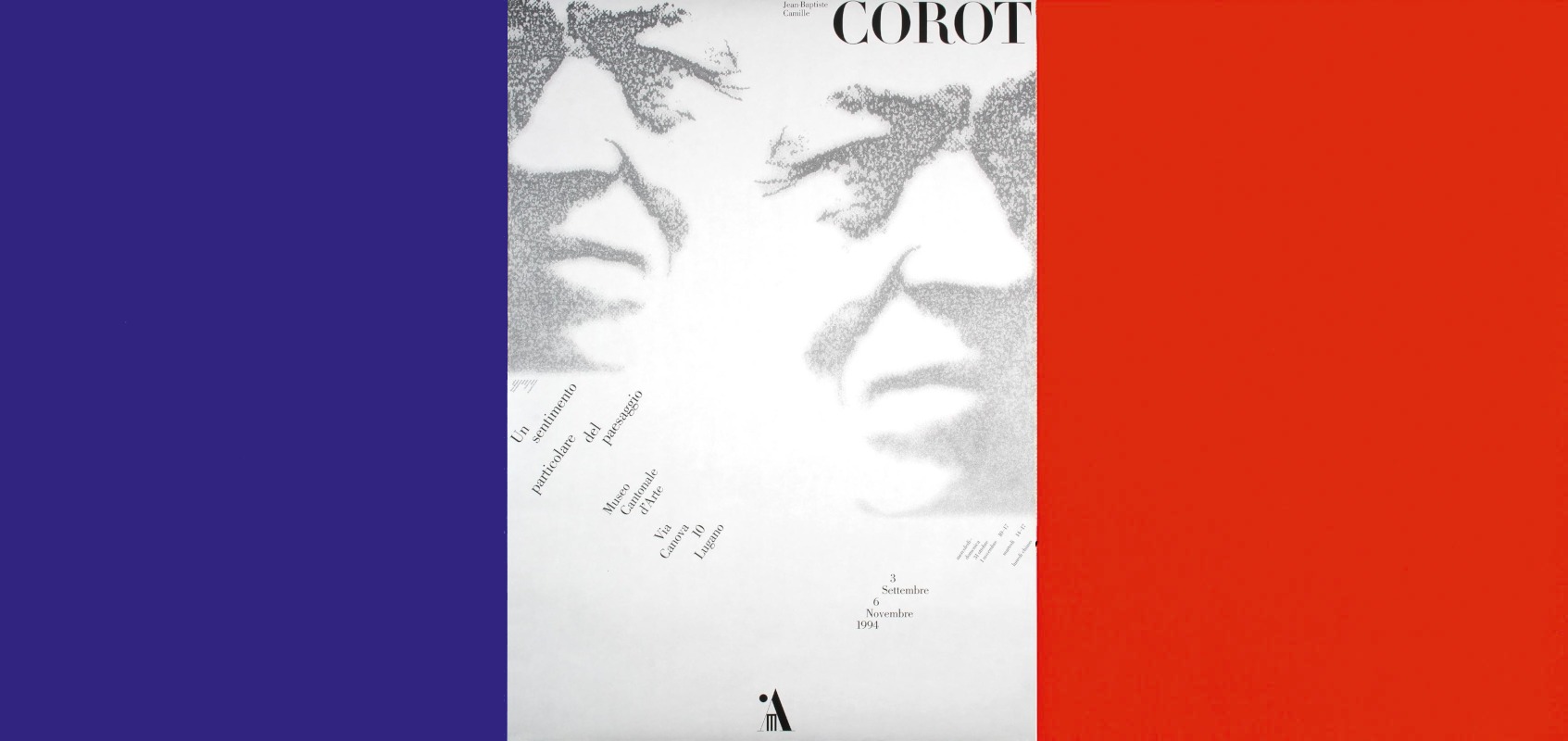
BM: When the Museo Cantonale d'Arte was going to open, Manuela Kahn, the director, wanting a strong visibility in the streets, decided for a massive poster campaign, including the F4 and the F12 sizes. For some reason, I did not like the idea of designing and printing a vertical and a horizontal version of the same poster. It seemed to me more reasonable to use the F4 poster also in the F12 format, and to develop complementary roles for the remaining two posters. Since Manuela had stubbornly wanted a logo for the museum, in order to introduce the logo, I made it gigantic. The poster was nearly filled. Just enough space was left for the name of the museum on one side, and the title of the first exhibition, Il Ticino nella pittura europea (The Ticino Landscape in European Painting) on the other. I decided to flank the typographical poster with a close-up of a portrait from the museum's permanent collection, and a detail of a landscape from the exhibition. Since the production of the posters was supported by a private foundation, I was able to select three different works from the museum collection and three more from the exhibition. They could be freely interchanged in the street and sold independently in the museum. A didactic note about the artist, a second note about the painting, and a small reproduction of the total work, were printed on the back of each poster.
FN-Q: By revealing its assemblage, you created an open system.
BM: I like your definition of “open system.” I like open systems. I like complex systems — not complicated systems — because they prevent too much repetition. As a matter of fact, the two remaining posters can still be used as a linear continuation of the first. Like I did in the Melotti poster. Or as an “introduction” to the last, like I did with Kandinsky. The paper joints are, in these cases, not expressed, giving a single large horizontal image Independent statements can precede the informational poster; they can also follow it, as in the Flammer/Paolucci exhibition: or they can flank it, as in Corot, where, having only a few spaces for triptychs, I simply silkscreened flat fields of color — which is very economical — to build the French flag. Or, again the same trick, in the case of the Panza di Biumo collection, where the yellow echoes the flat yellow of the room song of No Mind by Allan Graham and the blue echoes the blue of Blue Oval by Robert Therrien, two complementary works that were facing each other in the exhibition.
FN-Q: You manage to turn limitations into possibilities.
BM: Walter Binder, the curator of the Swiss Foundation for Photography in Zurich, asked me to design the poster for an historical exhibition about photographers from Ticino. It was the first time he contacted me, and he immediately mentioned that the Foundation had very little money. Manuela Kahn, with whom I had just started working, told me that the winter exhibition was going to be on photography. When I realized that it was the same exhibition, I proposed to both to make only one poster. They would save money on the project and the printing. Since photography is “double” — positive/negative, light/shadow — it was reasonable to split the poster in half. In Zurich, they would just hang it upside down.
FN-Q: The search for connection is also evident in the Flammer/Paolucci triptych. All the elements seem interwoven in an inextricable way.
BM: Again, I started with the selection of two significant works that would stand the bustle of the street. The works I used bear in common the strong verticality of their structure. But at the same time, they are totally opposed: dark vs. light, and full vs. empty. I therefore chose two opposed symbolic figures to become the skeleton of the informational poster. The blue disk was originated by Paolucci’s sky blue amoeba. The black rectangle was in connection with Flammer's photographic work based on the ancient Egyptian Book of the Dead. Under each photograph Flammer handwrote the quote from the Book of the Dead that had guided him. The twenty-two photographs were exhibited in a painted black oval space I had designed to avoid corners in the development of the narration. The strokes of light over the Egyptian columns and the slenderness of Paolucci's Object generated the vertical bars containing the names of the artists. To weaken their integration with the superimposed symbolic figures, and to strengthen the allusion to a stroke of light, I softened the right and left sides of each bar by screening the edges. At this point, I was compelled to perpetrate a typographical capital sin: setting the fourteen letters of each name, one letter under the other. But, I must admit, my Swiss side is still recalcitrant. All the texts could only quietly run along the top. With five contrapuntistic black bars to structure the information.
FN-Q: In the case of the Melotti poster, you also doubled the title. What made you repeat Melotti’s name in such a rigorous play of the opposites: positive vs. negative, bold vs. light, extended vs. compressed, uppercase vs. lowercase letters?
BM: The two Melotti logos were designed to evoke the radical change that occurred in his sculptural work. Melotti sculptures up to 1937 were elementary and were constructed according to simple geometric grids or based on primary volumes. When he goes back to sculpture at the end of the fifties, he begins to use thin steel rods and metallic gauze. The elements he playfully assembles are often so light that the sculpture becomes kinetic.
I tried to suggest this kinetic quality with the introduction of the silver background. The relationship between the two logos keeps changing as you move along, causing a constant shift in the tonal hierarchies. The square grid of the first logo, inspired by the 1935 Scultura n. 21, tightly holds the second logo and continues in the lower half of the poster, integrating the typographical play of dates and timetables. Actually, the total triptych is constructed on a very simple square grid. The height of the poster determines the side of the square portrait, facing and located to the right, and the height of the rectangle, formed by two squares that contain the sculpture in the center of the tryptich. The same rectangle, lying horizontally in the upper left, contains the logos and the two titles.
FN-Q: There is always a sense of rightness, a lack of affectation in your work. In some cases, even a disarming directness. How do you apply these qualities?
BM: When you have a problem, the right solution always seems inevitable. The problem is to know what the problem is. Asking the right questions is more difficult than finding the right answers. When I bent the Pirelli P, I thought this was the only possible thing to do. They already had a logo and wanted a trademark. What is the best possible relationship between the existing logo and the second device? What should it say?
Since “Quotidiano” means “daily,” I suggested to rename it, everyday, with the date of that day. “Quotidiano del 19 Gennaio '88, Quotidiano del 20..., Quotidiano del 21... .” And since the nineteenth was a Tuesday and the twentieth a Wednesday, I had it clearly stated on labels that moved across the top. A visualization of the week. What are you often looking for in a newspaper heading? In 1986, Abitare magazine was going to be twenty-five. The only thing to do was to paint the masthead silver. It took the whole year to do it. How do you make an anniversary party last one year without spending any money?
FN-Q: Rick Poynor wrote that you have "developed a graphic language untouched by the passing whims of fashion". What is the relation of design to the world of fashion (current trends)?
BM: The fashion system is like a pocket dictionary with continuous revised editions. The only constant in the constant changes is that a lot of words are missing.! think that changes in design should be dictated by the content, not by the fashion system. New design, as Charles Eames stated, comes from new problems. To end this conversation, I would like to quote another master, Achille Castiglioni. There is not a Castiglioni style. There is a Castiglioni method,” he asserted in a recent interview for his MoMA exhibition in New York, a method, he added, of a “designer out of fashion.”
Interview by Franc Nonoo-Quarcoo, University of Maryland, Baltimore Country, USA, 1988.