

Neue Grafik from Switzerland to the world
The history of the magazine Neue Grafik, which appeared between 1958 and 1965 in 16 single issues and one double issue, has not yet been written. Although standard works and occasional publications on commercial graphics in the 20th century repeatedly depict the magazine's cover, and there are references to connections between Gute Form1 and Neue Grafik – the environment, origin, and impact of this Swiss magazine on 20th-century graphics, which is one of the world's most influential publications for graphic design, have so far remained unexplored.
Classifying Neue Grafik under terms like "International Typographic Style" or "Objective-Functional Typography" saves book publishers and authors from analyzing a magazine whose task was far from just being a mouthpiece for Swiss graphics around 1960.2 What was new about Neue Grafik was not only the content, but also the historical situation and the group profile of the publishers: no school, no association of like-minded individuals, no professional or interest group was in the background providing information and distribution.3 For the first time, a design magazine appeared whose publishers did not primarily see themselves as architects or artists; these – Richard Paul Lohse, Josef Müller-Brockmann, Hans Neuburg, and Carlo L. Vivarelli – jointly determined content and design, without hierarchy and chief editorship,4 in a publishing house that was also reorienting itself critically in other areas.5
On February 15, 1956, these future publishers meet at the Zurich restaurant Seilbahn to discuss the founding of a magazine for New Graphics.6 However, another two years pass before the imminent appearance of Neue Grafik is announced.7 The occasion for this announcement is Josef Müller-Brockmann's appointment as Ernst Keller's successor as head of the graphics class at the Zurich School of Applied Arts. Müller-Brockmann uses the assumption of office for his own form of inaugural lecture: He does not give a lecture, but has the school's graphics class set up an exhibition "Constructive Graphics" with commercial graphic works by his friends Richard Paul Lohse, Hans Neuburg, and Carlo L. Vivarelli. Hans Neuburg writes the introduction for the catalog and designs it and the poster. For the catalog illustrations, they use printing blocks intended for the first issue of Neue Grafik.
Let's complete the exhibitor triangle: Lohse – Neuburg – Vivarelli to a square, more precisely to a quadrilateral: the fourth corner is Müller-Brockmann. This is written by the director of the School and Museum of Applied Arts in Zurich, the Bauhaus-trained architect Hans Fischli, in the foreword of the exhibition catalog. Fischli, who was also involved in establishing modern design in Zurich as the head of the museum and school, had already involved the four later publishers of Neue Grafik in a large project eleven years earlier, in the "Züka" – the Zurich Cantonal Trade and Agriculture Exhibition.8 Together with the city councilor in the Zurich Building Department, Edgar Woog,9 he had succeeded in giving the "Züka" a light-modern architectural form and also in realizing a counter-image to the "Landi style"10 after 1939 with the artistic-graphic design.
In an article for the Werkbund magazine Das Werk, Hans Neuburg summarizes the stylistically new aspects of the "Züka graphics" – already using the term "constructive" which would gain central importance years later: "As far as possible, he [Hans Fischli] entrusted graphic designers who think and work not decoratively but constructively with tasks that suited them; furthermore, he tried to design the entire Züka in terms of exhibition technology, architecture, art, and graphics based on the idea of an improvisation that had become form. [...] This novel, courageous approach, which was exposed to certain risks, led to a kind of 'Züka style', which manifested itself mainly architecturally and graphically through element compositions of squares, circles, triangles, and other geometric forms."11
Hans Neuburg designed the Construction Industry and Building Specialties section; Josef Müller-Brockmann visualized the Forestry section; Carlo L. Vivarelli, together with Robert S. Gessner, designed the graphics for the Applied Arts and Liberal Professions section. In addition – unlike at the "Landi" – constructive-concrete art was integrated for the first time into an exhibition in Switzerland that was aimed at broad sections of the population. The first version of Max Bill's Continuity was installed as a free-standing sculpture on the shore of Lake Zurich; Carlo L. Vivarelli designed a free-rhythmic wall sculpture for the exterior wall of the exhibition cinema. And Richard Paul Lohse created one of his few three-dimensional free works. He transformed Hans Fischli's construction principles for the "Züka", which provided for reusable wooden elements for the hall buildings, into a construction of white wooden elements that stood out in a grid-like arrangement against a black square on the entrance side of the lake restaurant.12
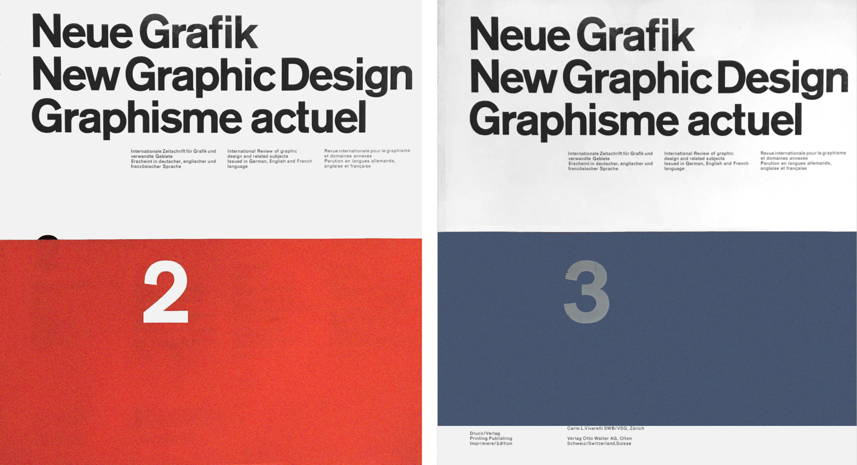
Neue Grafik / New Graphic Design / Graphisme actuel No.2 July 1959 Neue Grafik / New Graphic Design / Graphisme actuel No.3 October 1959
In retrospect, this meeting of the later Neue Grafik publishers reveals that while the systematic approach to design problems and some biographical experiences connected them, the four designers set different priorities in their work.
There is Richard Paul Lohse, painter and graphic artist, co-founder of the Alliance, the association of modern Swiss artists.13 Through his development work for Bauen+Wohnen, he has extensive experience in the complex organization of magazines. He sees his role in the editorial team of Neue Grafik, among other things, as "being a link from the free artistic side to graphic design."14
Hans Neuburg,15 born in 1904, is known to Lohse from their joint work at the Zurich advertising agency Max Dalang. Neuburg was a copywriter there; from the early thirties, he works as a consultant and designer primarily for industry. Sulzer, Feller, and Philips are among his clients. Hans Neuburg designs corporate identities with distinctive logos and complex corporate designs for numerous Swiss companies. He does important mediation work for modern art in Switzerland with exhibition reviews, but he also writes sports reports. In 1952, he is the editor and designer of the catalog for the "World Exhibition of Photography" in Lucerne, for which Lohse compiles the sections on architecture and photography and art.
While Lohse and Neuburg consciously experience the time of the First World War and the political changes of 1918/19 as well as the rapid change of art isms around 1920, while both gain nationwide recognition for their commercial graphic design in the thirties and forties, Josef Müller-Brockmann16 and Carlo L. Vivarelli belong to a generation that finds attention and success with a broader public for their graphic works only after the Second World War.
Thus, Josef Müller-Brockmann, born in 1914, includes only one example of his graphic work from the years before 1945 in his monograph published in 1994. After Müller-Brockmann is admitted to the Association of Swiss Graphic Designers (VSG) in 1937 and becomes acquainted with Lohse and Neuburg there, his further professional success is delayed by active military service.
He serves in the Swiss Army for the entire duration of the war. From 1945 onwards, his commercial graphics are initially illustrative-drawn, alongside a moderately modern use of typography on posters. In 1951, he turns to freely composed and soon constructive graphics. With posters for music events and the Automobile Club of Switzerland in 1953, Müller-Brockmann's strictly systematic designs begin.
Carlo L. Vivarelli,17 born in 1919 in Zurich, after his training at the Zurich School of Applied Arts, first visits the Art Deco graphic artist Paul Colin in Paris in 1939. At the beginning of World War II, he is conscripted in Switzerland. During the war, Vivarelli receives Swiss citizenship. In 1946, he is appointed artistic director of Studio Boggeri18 in Milan, where the objective photo and typographers Xanti Schawinsky and Max Huber had previously worked. In 1947, Vivarelli returns to Zurich. In 1949, using a photograph by Werner Bischof, he designs his probably most famous photo-typo poster "For Old Age". Parallel to his commercial graphic work, Vivarelli begins his painting activity in 1950 – after the wall relief he created for the "Züka" in 1947 – and in 1960, sculpture is added as another form of artistic expression.
In the introduction to the first issue of Neue Grafik, dated September 1958 and delivered mid-November, the publishers, together with the director of Otto-Walter-Verlag, Josef Rast, present the program of the magazine: "Not the modern for its own sake or the daring, original at any price seems desirable to them [the publishers], but the solution achieved with tectonic means." Neue Grafik "not only wants to present, it also wants to argue, explain, enlighten, teach, document. [...] The attitude of 'Neue Grafik' is, in contrast to existing publications, exclusive, consistent, and uncompromising."19
Here, a clear distinction is made from existing graphic magazines.20 By no means do LMNV, as the publishers jointly sign, want to publish just a contemporary magazine on commercial graphics of Swiss origin. The surname abbreviation is already part of their program contribution to modernism, in which individual expression gives way to common positioning.The Neue Grafik team understands graphic design as an aspect of comprehensive activity in industrial society: It's about the visualization of communication, not advertising; not about the eternal change of fashions, but about the historical conditions of modernism; about complex systems with variable components and not about individual artistic ideas.
This concern requires care, reflection, and knowledge, both from the publishers of the magazine and from their readers. For Neue Grafik should be read, not just looked at: No image entices on the title. The long text columns of the first pages manifest that this is not about illustration, but information. And by using the same grid for the title and inner pages, the highlighting of individual topics or authors is prevented – no first among equals should stand out here. As in the parallel-founded ulm and before the British Form, an opening of the magazine's content to the outside is thus achieved.21
The publishers and the publishing house certainly appreciate the effect of large colored areas, as they demonstrate in the first issue with high-quality reproduced color photographs by René Groebli.22 But color in Neue Grafik does not mean colorful, as evidenced by Groebli's near-monochromes and Lohse's poster series for the June Festival Weeks in Zurich, also created in 1958 using a photograph by René Groebli.
The time is favorable to address an international audience with Neue Grafik and its content and design program. Pavilions from East and West coexist peacefully at Expo '58 in Brussels; global industrial production, the beginning use of cybernetic techniques in administration, and the exchange of scientific research results make it seem possible to secure the world's population beyond mere subsistence. And since August 1953 – not too far from Zurich – at the Ulm School of Design (HfG Ulm), people of different national origins have been testing a globally respected teaching operation for design,23 an experiment discontinued in 1968, which the four publishers solidarily support as lecturers, speakers, and examiners.
Neue Grafik fundamentally breaks with the continuation of the proven. Instead of the symmetrical type area24 in the Golden ratio, modular grid systems emerge; instead of calligraphic ornamentation and appealing illustration, the magazine presents the use of photography in printed materials and the objective sans-serif typefaces Univers,25 Neue Haas-Grotesk (renamed Helvetica in 1960), and Folio, whose grid-based application defines the objective Swiss graphic design of the 1960s with its worldwide impact
However, the comprehensive reception of contemporary graphic design with "partly highly current illustrations,"26 often created by the publishers themselves, serves not only to inform or spread a new, Swiss-founded international style in typography. In addition to pure information about the current use of graphic means and processes, the contributions indirectly convey ideas of contemporary environmental design: The household is fully electrified; the apartment is furnished with objective furniture from Zurich's Wohnbedarf; modern pharmaceuticals and medical technology help in case of illness; train, airplane, or newly planned road constructions, mastering geological danger spots with the help of new construction machines, enable comfortable travel.
The rhythm for this life in technical civilization, overcoming language and national borders, is no longer set by the metronome or Swiss precision clock, but comes from the sound conserve as a modern jazz recording; modern office machines facilitate employment; leisure time is not determined by amusement or shopping, but rather visits to exhibitions or concerts serve comprehensive personality development.27
Contemporary does not mean without preconditions. The title Neue Grafik also stands for this, associating the use of the word "New" as it was understood especially in the 1920s in connection with the constructivism-based combination of art and technology: With Neue Grafik, the Zurich editorial team ties in with titles and concepts such as Die Neue Typographie, Neues Bauen, or Neues Wohnen.28 This reference to predecessors of the new is not merely claimed but continuously documented: With Neue Grafik, the historiography of modern graphic design receives its first and, to this day, exemplary forum.
Richard Paul Lohse's programmatic essay "The Influence of Modern Art on Contemporary Graphic Design" in Neue Grafik, No. 1, serves as the starting point. Beginning with Cubism, Lohse presents the word/image/structure relationships in Dadaism and Futurism, Surrealism and New Objectivity, De Stijl and Russian Constructivism; the use of artistic discoveries for posters and brochures, in leaflets and advertisements, to present the objective Swiss commercial graphics since the late 1920s via the Dessau Bauhaus and the Swiss magazine ABC. In this context, Lohse emphasizes the importance of his former teacher at the Zurich School of Applied Arts, Ernst Keller,29 as the "founder of an expressive planar style in Switzerland" and shows as further exemplary "graphics of this time" [as the subheading states] works by Anton Stankowski (from 1930) and Max Bill (from 1931), Max Huber (from 1945), Karl Gerstner (1956) and Mary Vieira (1957) as well as commercial graphic examples of the three co-editor colleagues from the years between 1946 and 1955.
Two things stand out in this compilation. On the one hand, Lohse generally values commercial graphics as a component of modern culture and design by pointing out the diverse connections and mutual influences between art and informative design; herein lies the enormous significance of the essay both for the development of the concept of commercial graphics towards that of visual communication30 and for later discussions on "High & Low" in art and popular culture.31 On the other hand, by focusing on the graphics of his Zurich colleagues, Lohse succeeds not only in highlighting the Swiss influence on international commercial graphics of that time but also in defining this Swiss graphics as primarily a Zurich pioneer product. Thus, Lohse and Neuburg had been contemporary witnesses of Dadaism in Zurich, and they had also experienced and helped shape the spread of Constructivism; the younger ones – Josef Müller-Brockmann and Carlo Vivarelli – were familiar with the diverse artistic currents from geometric-constructive tendencies to Surrealism from the 1930s. Particularly the adoption of elements of Constructivism in typography, as inspired in Zurich around 1930 by the works of Anton Stankowski, had a formative effect on LMNV's commercial graphic works as well as on those of other artists and graphic designers based in Zurich. Added to this were the influence of the teaching at the Bauhaus and Herbert Bayer's works, for example, on commercial graphics by Max Bill and Herbert Matter.32 In contrast, the teaching at the Basel School of Arts and Crafts was less oriented towards artistic experimentation and more focused on – also through the influence of Jan Tschichold, who returned to classical typography – detailed knowledge of typesetting rules, canonized proportions, and the teaching of graphic techniques and material science.33
It is therefore logical for Lohse's theme and essay that – unlike in Hans Neuburg's article "The Best Modern Posters in Switzerland 1931-1957" in the same issue of Neue Grafik34 – examples from Emil Ruder35 and Armin Hofmann,36 who taught at the Basel School of Arts and Crafts, are missing,37 although both were initially even considered as editorial members of Neue Grafik. The works of Mary Vieira38 and Karl Gerstner,39 based in Basel, included by Lohse, represent a generation whose graphic-artistic education falls into the post-war period and who have come to know the works of the Zurich pioneer generation as role models.
When Lohse emphasizes the influence of modern art on contemporary graphics, he is not concerned with describing and illustrating a completed historical fact, but with presenting the justification and significance of formal large forms for contemporary graphics. Lohse shows the calculated grid organization of the surface and the economy of means, the rhythmization of surface forms, and the use of printing techniques for color accentuation as commercial graphic consequences of constructive-concrete art discoveries following Cubism.
With his programmatic overview, Lohse introduces a series of articles on historical topics in Neue Grafik. Guest authors follow with extensive overall presentations on the typography of Futurism, De Stijl, and the Bauhaus. Hans Neuburg comments on Anton Stankowski's achievements in Zurich, thus for the first time placing the significance of Max Dalang's agency in an international context.40 In Neue Grafik, No. 9 (March 1961), the typographic structures of the Polish avant-garde from 1920 to 1930 can be discovered – the presentation of works previously known only to specialists in Western Europe also contributes to East-West cultural exchange.41
The New Graphic Design also overcomes political boundaries. In his article "A Pioneer of Photomontage, John Heartfield" (No. 8, 1960), Richard Paul Lohse shows Heartfield's works for the Arbeiter-Illustrierten-Zeitung as well as the Malik and Neue Deutsche Verlag from the 1920s and 1930s. Anticipating the expected outrage over these montages created as socialist agitation tools, Lohse states that the publishers of Neue Grafik are publishing Heartfield's works "here not because of their political content, but as documents of an intense and burning will to design." This statement, cleverly placed at the end of the first column of the article, has a calming effect on representatives of an apolitical design approach. However, in the penultimate sentence of the text, there is a statement by Lohse expressing his conviction about the correctness of Heartfield's image-text montages: "In these works, intention and ideology are carried by a photo-artistic idea and a realism that convinces through lapidary accuracy and the truth of an artistic-visionary thought."42
In Neue Grafik, No. 14 [December 1962], Lohse introduces the magazine of the Amsterdam architects' group De 8 en opbouw, which advocated for socially responsible, non-elitist constructive architecture in the 1930s. For an exclusively graphic trade journal, as some reviewers misunderstood Neue Grafik to be, there was something unusual to read: "Decisive for the foundation and existence of such a journal was the unshakable belief in fully standing up for a new form of design in art and architecture, that is, the basis of the actions was the firm conviction that the idea represented was a social necessity and an aid to people, that the task for people must be to expand consciousness for a clear design method.43 Lohse also notes the absence of an editor-in-chief at De 8 en opbouw, as was also practiced by Neue Grafik throughout its entire publication period.
In the article "Dust Jackets from the 1930s of Büchergilde Gutenberg" in issue 16 [July 1963], the penultimate issue of Neue Grafik, Lohse, at sixty years old, places his own works in the history of modern graphic design. Unlike the articles on historical topics, he limits himself here to a few, but large-format illustrations. As the last example from his extensive work for the cooperative, socially engaged Büchergilde, he chooses a color variant of the dust cover [1947], whose blue bars are fitted into the grid at the top of the magazine page without print format limitation. By utilizing the free space on the page and the connection with the adjacent right page, Lohse achieves a light, almost floating impression of the image and text areas. Additionally, a content-historical connection is created between Lohse's horizontal row order from 1947 and the neighboring depicted point structure posters by Almir Mavignier44 from 1961 and 1962. The sequence of images subtly points to the international spread and development of constructive-concrete art, to which Lohse has made a significant contribution with his modular and serial orders since the 1940s. The double page exemplarily shows how LMNV does not view historical aspects as concluded in Neue Grafik, but rather connects history and actuality through the relationship between content and graphic arrangement.
This connection also inspires other magazine editors and designers. For the English Typographica, Herbert Spencer adopts the Neue Grafik concept of presenting the foundations of modernism for commercial graphics as well. Generously illustrated and strikingly designed, the Typographica articles about John Heartfield, Alexander Rodchenko, Diter Rot (Dieter Roth), Kurt Schwitters, or Piet Zwart45 do not always achieve the information density of thematically similar essays in Neue Grafik.
Even though Lohse and Neuburg can authentically convey history as contemporaries of the "heroic avant-garde,"46 their activity for Neue Grafik is not limited to this contemporary witness role. Hans Neuburg, for example, in whose studio the editorial meetings also take place, writes detailed comments on the respective works of his fellow publishers, but he also refers to a wide range of topics,47 covering railway graphics to beer coasters to corporate identity.48
Lohse also uses the treatment of contemporary topics to present exemplary achievements, but equally important to him are fundamental questions. For example, in Neue Grafik, No. 2 (July 1959), continuing his book Neue Ausstellungsgestaltung, he reports on Expo '58 in Brussels. He limits the image selection to objectively and modularly constructed buildings of some nations. Special attention is given here to the use of color and typography for exhibition organization. This informative use using graphic means, Lohse contrasts the representative and thus uneconomical symbolism of exhibition art, often exaggerated in scale, in the text contribution following the pictorial report: "In accordance with an inherent basic current of allegorism in every world exhibition, the exhibition grounds were strewn with towers, masts, spirals, free-standing sculptures, the costly products of modernism, to be classified into 'Constructivism' and 'Expressionism'."49
This criticism, which can be applied to Le Corbusier's large plastic form of the Philips Pavilion, includes Lohse's considerations for an exhibition planned but not realized at the Zurich Museum of Arts and Crafts called "modern – modernistic".50
As a consequence of his reflections on the economy and design of exhibitions, Lohse proposes a permanent international comparative show as a constantly updated inventory of global culture instead of changing, nationally organized world exhibitions. Lohse's philosophical-political stance flows into the proposal, which takes into account the development of technology and design, with the demand for an international community of free and equal people.
In issue 3 [October 1959], he publishes remarks "On the Sociological Situation of the Graphic Designer", a profession that Lohse learned and practiced for many years even after his international recognition as a painter. First, he describes the historical situation that requires the profession of graphic designer, refers to the competitive economy as a prerequisite for the job profile, and then assigns the graphic designer an "intermediate position between free art and applied art". The fact that commercial graphics can learn especially from constructive-concrete art, but that it lacks recognition in contrast to constructive or new graphics, can be read as a description of personal life experience.51
Tragic in Lohse's view is also that graphics associated with ever-shorter product cycles often have to be changed, causing graphic work and its authors to quickly fall into oblivion – a process against which Neue Grafik resists with its articles focused on historical themes. Consequently, Lohse sees the profession of graphic designer exposed to particular dangers. On the one hand, the graphic designer should not only produce fashionable and deceptive advertising; on the other hand, due to his craft knowledge, he should not be tempted to give up a perceived, personal achievement-hardly-recognizing activity and instead produce supposedly individualistic art. Therefore, analogous to the work of architects and product designers, there is a special responsibility for graphic designers not to succumb to both temptations.
The essay stands in the tradition of reflections on design, as they have established positions of lasting "Good Form," form without ornament, and material justice since William Morris and Adolf Loos. New in it, however – compared to the repeatedly differently formulated Werkbund postulates of the orderly, decent, and use-appropriate in design52 – is the knowledge of the difficulties for individuals to endure such a work attitude pressured by economic forces.
Therefore, Lohse also calls on those responsible for society as a whole not to create apparent free spaces in the consumer society, where "art promotion by the economy [...] has a calming effect on the social situation,"53 but to implement the demands of responsible art in society.
The editors of Neue Grafik have demonstrated how such responsible work of the commercial graphic designer can look, not only with clear forms and the accent-setting and order-creating black on pure white but also with the selection of their topics. Josef Müller-Brockmann even created "a list of products and ideas for which I did not want to work. These included tobacco products, alcoholic beverages, war toys, military institutions, land and house speculation, and political parties."54
Hans Neuburg describes this character of constructive graphics visualizing the "morality of objects" using Richard Paul Lohse's Wohnbedarf advertisements in issue 11 [December 1961] of Neue Grafik55: "The graphic designer has not only identified with the functionally determined seating furniture forms but has given them the corresponding graphic effect space by presenting the most essential detail in large scale, displaying the chair frontally and in profile, and organizing the advertisement spaces in such a way that the photographic and textual elements come into their own, as this corresponds to the practical application of the chairs in their work area corresponds."56 Lohse succeeded in creating graphic designs precisely tailored to the subject with these advertisements57 for Wohnbedarf. The chosen illustration for the Marcel Breuer advertisement captures the linearity of the cantilever tubular steel chair, while the backrest detail of the Saarinen chair emphasizes the sculptural quality derived from the surface.58 The intelligently and non-schematically used grid thus forms the basis of a balance between freedom and order, which Lohse also sought analogously for human society.
With the double issue 17/18 [February 1965], the series of Neue Grafik ends. Published more than a year after the previous issue 16 [July 1963], this final volume can be considered a summary of seven years of design journalism in Zurich graphics. Documentary and reportage photography are appreciated here, as well as the influence of the Bauhaus on 20th-century design. Posters from recent years – including Lohse's poster for the "Musical Instruments" exhibition at the Zurich Museum of Arts and Crafts (1962) – are presented, and exemplary teaching and design from Zurich to Tokyo are shown. Once again, an article deals with Lohse's work for Zurich's Wohnbedarf – this time Lohse himself explains his advertisements and folders, brochures and catalog sheets.59
However, a new theme emerges alongside the summary, departing from the examples of authorial graphics: With Lohse's article "National Flags,"60 Neue Grafik turns to anonymous design, pointing to the worldwide and largely unconscious use of clear form and color language, to the traditions of the deliberately simple. The essay comprehensively and systematically addresses the topic, which had only been hinted at in graphic design history61 until then. Aspects of historical perception and political statements stand equally alongside the formal analysis of proportions and contrasts of flags: "The simplification, the design of the surface through equal vertical divisions, was an expression of a democratic aspect of will. Proof of this statement are the consciously equally formed proportions of the surface, the equal measures of colors. [...] The equal rights of all colors, the equal units of measurement were an unmistakable characteristic of the political will formation of the democratic revolutions of the 18th and 19th centuries. In this sense, the invention of the tricolor represents a political fact of the first order, especially because in its original version it dispensed with emblems or illustrative additions."62
Although a small book may have inspired the flag article,63 and Lohse may have drawn on precursors and beginnings of his applied graphic practice here64 – with such remarks he goes beyond the description of graphic facts as well as beyond an art historiography that merely notes stylistic changes and developments. His explanation of the tricolor uses concepts and statements that similarly apply to the artistic principle of color quantity equality he established; thus, he places his own creative and artistic practice in the context of the epoch.65
Parallel in time to the analysis of the "national flags," Lohse transforms the Zurich coat of arms into an art signal for the poster "Zurich Artists at the Helmhaus" in 1964. He comments that the poster "represents an attempt to transform the given form of the Zurich flag into poster-effective surface elements and to create a horizontal and diagonal movement by shifting them. This resulted in a connection between what is given from tradition and the active."66
This poster and the article "National Flags" mark in many respects the conclusion of Lohse's applied graphic activity. Although he continues to work for previous clients, he no longer establishes new client relationships and increasingly limits applied graphics to his own typography. With the article "National Flags," Lohse also ends his written expositions on questions of applied graphics. Besides the now-determining free artistic activity, he turns to text formulations on political, art historical, and theoretical topics, but above all to texts on his own work.
With the last issue, Neue Grafik has indeed become international, as the publishers hoped at the beginning, not only in its themes but also in its impact. The farewell statement accompanying issue 17/18 speaks of an interruption and the intention to continue the publication of new graphics "perhaps in a similar external [form], but in the form of a comprehensive annual volume with more consistently and tightly chosen content" – it remains an announcement. However, the continuation takes place even without annual volumes produced by LMNV: In Zurich and Ulm, Basel or London, worldwide, the issues of Neue Grafik are studied, their illustrations were analyzed, and their explanations were incorporated and further developed. The rational construction in design and systems thinking leads to the complex corporate design developments of the 1960s and 1970s, to the socially critical questioning of whom designs serve, and to the responsible use of reason instead of the instrumentalization of creativity. The fact that this process is not yet complete does not change the fact that, for commercial graphics, it has had a significant impact on the world from Zurich since 1958 at the latest – also with and through Lohse's exemplary works
Michael Lenz.
Notes
1 "Good Form" refers to the Swiss Werkbund's campaign from 1952 to 1968, which aimed to promote "well" designed consumer goods. See Peter Erni, Die Gute Form, Baden 1983 and the same author, "La forma dell'utile. Il disegno razionale svizzero," in: Rassegna No. 2, 17th year (62), Bologna 1995 (texts in German edition under the title Wege zur "Guten Form," Basel, Berlin, Boston 1995).
2 See, for example, Richard Hollis, Graphic Design. A Concise History, London 1994 with a useful overview of the post-war situation of Swiss graphic design. Although Judith M. Grieshaber and Manfred Kröplien show in Vom Bauhaus ins Land der Riesenwaschkraft: Nachdenken über Graphikdesign, Stuttgart 1992 a large-format cover image of Neue Grafik, No. 1 [September 1958], they do not mention the publishers and their works in the text. Currently, Friedrich Friedl, Nicolaus Ott and Bernard Stein in Typographie wann wer wie, Cologne 1998 erroneously attribute the title design of Neue Grafik to Richard Paul Lohse. Annemarie Bucher sees the connection to "good form" in Spirale – Eine Künstlerzeitschrift 1953-1960, Baden 1990; she also devotes a separate text section to Neue Grafik. For classification in graphic trends of the 20th century, see, for example, the extensive appendix Major Resources in Rob Carter, American Typography Today, New York 1993.
3 This distinguishes Neue Grafik from De Stijl or bauhaus, and even more so from magazines such as Die Form, Werk or Gebrauchsgraphik or the association organs Typographische Monatsblätter and Typographische Mitteilungen.
4 Neue Grafik, No. 1 lists Carlo Vivarelli as responsible for the design, all subsequent issues name Hans Neuburg for this, from issue 8 [December 1960] also as editorial editor. However, documents in the Richard Paul Lohse Archive prove that Lohse designed some of his articles himself, and the same can be assumed for the other publishers. Lists also show, among other things, image procurement and editing of external articles as well as shares in contributions signed with LMNV [Lohse/Müller-Brockmann/Neuburg/Vivarelli]. The Richard Paul Lohse Archive also contains minutes of editorial meetings from the period between 10.10.1961 and 20.8.1962, which concern the work from issue 12 (March 1962) onwards.
5 The Walter-Verlag was initially Catholic-conservative oriented. From 1951, socially critical photo reportages by Magnum photographer Werner Bischof, among others, appeared in the illustrated magazine Die Woche. With Otto F. Walter's entry into the publishing house, numerous works began to be published in the context of international text and image avant-gardes. For the period of Neue Grafik, the following should be mentioned: The social reportages Umfrage in Palermo [1959] and Banditen in Partinico [1962] by Danilo Dolci, the Textbücher 1-5 [1960-1965] by Helmut Heissenbüttel, important for the development of concrete poetry, Karl Pawek's Totale Fotografie (1960; reviewed by Richard Paul Lohse in Neue Grafik, No. 11 [December 1961]) and the collected works of Alfred Döblin (from 1960).
6 A different account in Josef Müller-Brockmann, Mein Leben: Spielerischer Ernst und ernsthaftes Spiel, Baden 1994, p. 51. Hans Neuburg also recalls Josef Müller-Brockmann's initiative in 50 anni di grafica costruttiva, Milan 1982, p. 12/13. See also a letter from Richard Paul Lohse to the publishers Arthur Niggli and Willi Verkauf dated 23.2.1956: "[...] A group of progressive graphic designers in Switzerland is considering a project that could be of interest to your publishing house, and I would be grateful if you could contact me during a visit to Zurich. [...]" Lohse wrote this letter at the time when his work as editor and designer at Bauen+Wohnen was ending.
With the Niggli-Verlag (initially Niggli and Verkauf) founded in 1950, constructive graphics received a committed publication venue from the mid-1950s, which was equally meritorious for constructive and systematic art as well as for architectural publications. In 1957, Karl Gerstner's analytical introduction to constructive painting Kalte Kunst? and the experimental prose Schiff nach Europa by Markus Kutter were published by Niggli. Karl Gerstner developed an experimental typography congenial to the text in a grid that has been frequently reproduced since then. Among the monographs, besides the one on Richard Paul Lohse [1962], only the collections on Max Bill [1958] and Hans Neuburg [1964], also published on the occasion of birthdays, should be mentioned here. Josef Müller-Brockmann published, among others, Gestaltungsprobleme des Grafikers (1961) and Rastersysteme für die visuelle Gestaltung [1981] with Niggli.
At the time, however, the progressive commitment of the Niggli publishing house remained limited to supposedly formal-modern; the political consequences of some modern world views were rejected. For example, in 1965, Arthur Niggli pushed through the publication of a letter defaming Meyer from Walter Gropius with an accompanying afterword by the publisher in the volume Hannes Meyer – Bauten, Projekte und Schriften, against the determined resistance of the heirs and the editor Claude Schnaidt.
7 Imprint of the catalog Konstruktive Grafik. Wegleitung 221, Kunstgewerbemuseum Zürich, Zurich (March) 1958, n.p.
8 Hans Fischli [1909-1989] represented an undogmatic-constructive, not formal-abstract modernity, which brought him into conflict with Sigfried Giedion, for example. For Adolf Feller AG in Horgen, whose commercial graphics were designed by Neuburg, Lohse and Vivarelli over a long period, Fischli designed factory, administrative and private buildings. The artistic design of the buildings incorporated sculptures by Fischli. For more on Fischli, see: Hans Fischli, Rapport, Zurich 1978 and Karl Jost, Hans Fischli – Architekt, Maler, Bildhauer, Zurich 1992.
9 Lohse was politically connected with Edgar Woog and others through the Switzerland-Soviet Union Society; Woog's wife Lydia knew Lohse since the Zetthaus period and designed the lettering and printed materials for her shop.
10 The "Landi" – National Exhibition 1939 – was planned as a showcase of Swiss culture and economy. However, with the outbreak of World War II during the exhibition period, its public image changed. It now stood as a symbol for the spiritual national defense of the four-nation confederation of Switzerland. "Landi style" in this context refers to an emphasis on pre-industrial, craft-based culture, as shown in the "Landi village". Yet the 1939 National Exhibition also included modern and avant-garde elements: Robert Maillart erected a thin-walled cement hall using shell construction, and Hans Coray designed his minimalist aluminum chair.
For Richard Paul Lohse's commercial graphics, the "Landi" was significant as he designed his first large-format illustrated book "Elektrizität/L'Electricité" (Zurich) after designing the hydropower and electricity economy sections at the end of the exhibition in 1940. Lohse's long-term design work for industrial companies like Escher Wyss followed immediately after. The founding of the Swiss Association for National Planning in 1943 also goes back to the "Landi". Lohse designed the first issue of the magazine "Plan" for this association of architects, engineers, politicians, and urban planners, which was related to the federal plan to combat unemployment.
11 Hans Neuburg, "Die Graphik an der Züka", in: Werk, No. 3 (1948), pp. 78f., quoted here from: Karl Jost, Hans Fischli, ibid., p. 60.
12 For exhibition graphics, see Richard Paul Lohse, Neue Ausstellungsgestaltung, Erlenbach, Zurich 1953; Karl Jost, Hans Fischli, ibid.; Lars Müller (ed.), Josef Müller-Brockmann – Ein Pionier der Schweizer Grafik, Baden 1994. The first version of Max Bill's Kontinuität, which was destroyed in 1948, was also set up for the "Züka" on the shore of Lake Zurich.
13 See John Matheson, allianz – Die Geschichte einer Bewegung, Zurich 1983. Lohse designed printed materials for the Allianz from 1937, including the Almanach neuer Kunst in der Schweiz in 1940. For the poster of the last Allianz exhibition in 1954, he chose a white-black lettering solution that remained easily readable even at night when colorful posters appear gray.
14 Letter to Dr. Vodoz dated 9.3.1959, carbon copy in the Richard Paul Lohse Archive. During the publication period of Neue Grafik, Lohse had important solo exhibitions in Ulm, Amsterdam, and Zurich, as well as participation in the 8th Biennale in São Paulo in 1965, which presented him as a significant representative of constructive art.
15 On Hans Neuburg (1904-1983), see also the contribution by Christoph Bignens in this volume. Lit. including: Moderne Werbe- und Gebrauchsgrafik, Ravensburg 1960; Hans Neuburg, Teufen 1964, 50 anni di grafica costruttiva, Milan 1982.
16 Lit.: Lars Müller (ed.), Josef Müller-Brockmann, ibid. and Josef Müller-Brockmann, Mein Leben [...], ibid. With his book Gestaltungsprobleme des Grafikers (Teufen 1961), Müller-Brockmann presented a systematic graphic design theory; his development of complex grid typography continues to influence teaching programs at numerous universities worldwide.
17 Carlo L. Vivarelli (1919-1986), like Richard Paul Lohse, was a co-examiner for exams at the HfG Ulm. Lit.: Susanne Kappeler, Carlo Vivarelli – Plastik Malerei Grafik, Zurich 1988.
18 At Studio Boggeri, from 1934 onwards, a significant contribution to the development of an early corporate identity for Olivetti was made through the design of printed materials and products. Initially using artistic elements of Futurism for advertising graphics, with Xanti Schawinsky's work until his emigration to the USA in 1936 and Max Huber's initial one-and-a-half-year activity from 1940, the Milan agency made a decisive turn towards objective commercial graphics combining photography and typography. Cf. Bruno Monguzzi, lo Studio Boggeri 1933-1981, Milan 1981.
19 "Introduction," in: Neue Grafik, No. 1 (September 1958), p. 2.
20 This distinction is already expressed in the spelling. As the reviewer of the Neue Zürcher Zeitung notes: "Only in the English and French name forms 'New Graphic Design' and 'Graphisme actuel' is the trilingual trade journal 'Neue Grafik,' published by Otto Walter AG (Olten), allowed to keep its 'ph'." "nr" in the Neue Zürcher Zeitung, evening edition of 16.12.1958.
21 This connection between inside and outside is one of the typical typesetting characteristics of trade journals, which do not need striking titles due to secure subscription sales. For sophisticatedly designed magazines, Lohse's grid-utilizing design system for the magazine Bauen+Wohnen can be considered exemplary, especially from issue 6 (1949) onwards. At the Ulm School of Design, British typographer and exhibition designer Anthony Froshaug (1920-1984) developed a grid similar to Neue Grafik for the magazine ulm (1st issue October 1958). Philip Steadman's design of the British Form (eds.: Philip Steadman, Mike Weaver, Stephen Bann), Cambridge 1966 to 1969, also used this graphic connection between inside and outside. Form gained importance for English-speaking design enthusiasts furthermore through the combination of current and historical explanatory contributions comparable to the concept of Neue Grafik. Cf. Herbert Lindinger (ed.), Hochschule für Gestaltung Ulm... – Die Moral der Gegenstände, Berlin 1987 and Robin Kinross (ed.), Anthony Froshaug – Typography & texts/Documents of a life, 2 volumes, London (not yet published)
22 New Graphic, No. 1,5. 45-51; on René Groebli (born 1927): René Groebli, Visions – Photographs 1946-1991, Sulgen 1999.
23 On HfG Ulm: Herbert Lindinger [Ed.], Hochschule für Gestaltung Ulm..., as mentioned. How unusual the internationality of Ulm seemed to outsiders at the time is described by Bernhard Rübenach in his radio essay "the right angle of ulm" 1959: "their greetings are ciao, grüezi, salu, hallo. they don't shake hands. they never speak of someone by their family name. they are all called: susanne, ilse, guy, morris, conny, deborah, dominique, cornelia, tomás." – First published in print in: Bernhard Rübenach, the right angle of ulm, Darmstadt 1987, here p. 32.
24 Cf. Georg Kurt Schauer, Typography of the Center, in: German Book Art 1890-1960, Hamburg 1963, pp. 241-245.
25 In: New Graphic, No. 2 (July 1959), Univers was first introduced by Emil Ruder to a readership not only versed in typography but also interested in questions of new design in general.
26 Lars Müller [Ed.], Josef Müller-Brockmann, op. cit., p. 35. The unsigned text is by the publisher and editor Lars Müller.
27 Cf. the themes in New Graphic: Household – No. 1, 14, 15; Objective Furniture – No. 17/18; Pharmacy and Medical Technology – No. 1, 5, 10, 14; Railway – No. 10; Aircraft and Road Constructions – No. 14; Internationality – No. 13; Modern Jazz – No. 5, 15; Office Machines – No. 8; Exhibitions – No. 2, 16; Concerts – No. 4.
28 Cf. Jan Tschichold, The New Typography, Berlin 1928; the series New Building in the World designed by El Lissitzky, Vienna 1930 [Authors El Lissitzky, Richard Neutra, Roger Ginsburger], the magazines The New Frankfurt, Frankfurt 1926-1931 and the new city, Gross-Gerau 1932-1934 or the exhibition "New Home Economics" at the Museum of Applied Arts Zurich 1930. The program and campaign of the Swiss Social Democracy "New Switzerland" 1943 still demonstrate the unbroken attraction of the "New" over decades.
29 Cf. W[illy] R[otzler], "Ernst Keller" in: ibid. et al., The Poster in Switzerland, Schaffhausen 1990, pp. 46-48.
30 On the history of the term: In 1948, the Visual Design department was created at the Institute of Design in Chicago. In the 1950 curriculum draft of the HfG Ulm, a Visual Design department is mentioned. When teaching began at HfG Ulm, the department was then called Visual Communication. The term was created at the time to achieve a distinction from craft-based training with calligraphy, hand-setting, and artistic printing techniques, in addition to addressing complex issues. After the end of HfG Ulm in 1968, many universities adopted parts of the methodology and the designation of Ulm's Visual Communication.
31 Cf. exhibition, catalog, and essay collection on High & Low, Museum of Modern Art, New York 1990.
32 Although both Constructivism and the objectivity alternating between construction and surrealism began as free artistic tendencies; besides establishing new styles, constructive and objective image-finding equally influenced the new or constructive Zurich commercial graphics – not denying their artistic origins – with far-reaching consequences.
33 Jan Tschichold [1902-1974] is certainly the most influential typography theorist of the 20th century. In the two writings and collections elementary typography (1925) and The New Typography [1928], he summarized the principles of early constructive design. Arrested by the Nazis in 1933 with his wife, Tschichold emigrated to Basel after his release from detention. There he designed for the Benno Schwabe publishing house and occasionally taught at the General Trade School. Around 1940, he turned back to axial text arrangement. A Basel citizen since 1942, Tschichold never denied the possibilities of New Typography even after his departure from it, but wanted to see it limited to industrial and commercial graphics. Lit.: Günter Bose and Erich Brinkmann (Eds.), Jan Tschichold – Writings in 2 Volumes, Berlin 1992.
34 Hans Neuburg, "The Best Modern Posters in Switzerland 1931-1957," in: New Graphic, No. 1 [1958], pp. 52-63. This article draws on the clichés previously used in the Constructive Graphics catalog.
35 Emil Ruder [1914-1970] studied in Zurich under Alfred Willimann and Walter Käch and later taught typography in Basel. In 1967, the first edition of his design textbook Typography was published by Niggli. As the only article by Emil Ruder in New Graphic, the introduction of Univers by Adrian Frutiger appeared in Issue 2 (July 1959).
36 Armin Hofmann [born 1920] studied at the Zurich School of Applied Arts; teaching at the Basel Trade School between 1946 and 1986. Lit.: Hans Wichmann (Ed.), Armin Hofmann – Work Exploration Teaching, Basel, Boston, Berlin 1989.
37 "Initially, Armin Hofmann and Emil Ruder are intended as editorial members, but for the strict Zurich group, Hofmann's graphics are too artistic, Ruder's typography appears too schematic to them." Lars Müller [Ed.], Josef Müller-Brockmann – Designer, op. cit., p. 35.
38 Mary [Maria] Vieira (born 1927) moved from Brazil to Europe in 1952, lives and works in Basel. Participated in the last exhibition of the Allianz in 1954. Contacts with the spirale group and publications with spiralPress Bern. Lit.: Beat Wismer [Ed.], Queen of Diamonds, Baden 1995.
39 Karl Gerstner [born 1930] founded the influential agency GGK in 1962 together with Markus Kutter and Paul Gredinger, which was influential for graphics in Switzerland and the Federal Republic of Germany, published among others Cold Art, Teufen 1957; (together with Markus Kutter) The New Graphics, Teufen 1959; Designing Programs, Teufen 1963; Compendium for Alphabets, Teufen 1972. Lit.: Karl Gerstner, Stuttgart 1992.
40 Hans Neuburg, "30 Years of Constructive Graphics", in: New Graphics, No. 3 [October 1959], pp. 27-35.
41 Henryk Berlewi's essay Functional Graphics of the Twenties, which appeared at Lohse's suggestion, broke with the notion that Constructivism was primarily a matter of De Stijl, Soviet revolutionary art, and later the Bauhaus. The international significance of this artistic avant-garde in other countries was thus exemplified for the first time. In 1962, the first overview of the previously almost unknown Russian and [later] Soviet Suprematism and Constructivism, Camilla Gray's The Russian Avant-Garde of Modern Art, 1863-1922, was published. Non-representational Hungarian, Czech, or Polish art between 1918 and 1938 was only mentioned in a few journal articles.
42 New Graphics, No. 8 [December 1960], pp. 13-17.
43 New Graphics, No. 14 [December 1962], pp. 47-49.
44 Lohse was co-examiner for Almir Mavignier's (born 1925) diploma thesis in 1958.
45 Cf. the anthology The Liberated Page, edited by Herbert Spencer, London 1987, with facsimile contributions from Typographica, first published between 1960 and 1967.
46 On the term 'heroic', cf. Smithson, Alison & Peter, The Heroic Period of Modern Architecture, Architectural Design, London, December 1965.
47 For example, Hans Neuburg on Vivarelli's Ovomaltine advertisements in New Graphics, No. 4 [December 1959], Carlo L. Vivarelli on the principles of logo design with logo examples by Neuburg, Lohse, and Vivarelli himself in New Graphics, No. 5 [March 1960]. Josef Müller-Brockmann addresses questions of education and international developments in his contributions. Hans Neuburg's article "The Picture Space and Its Laws" in New Graphics, No. 12 [March 1962], which first appeared in Werk as an expanded reproduction of an article about Lohse, can be considered a well-founded overview of Lohse's artistic activities before the first monograph on the occasion of Lohse's sixtieth birthday.
48 Cf. Neuburg's contributions in: New Graphics, No. 10 [June 1961], pp. 20-42.
49 New Graphics, No. 2 [July 1959], p. 10ff.
50 Cf. Note 17 in the essay Modular Order – A Vision of the Industrialized Age by Bela Stetzer in this volume. In Switzerland, Lohse's criticism of this use of plastic arts for Expo '64 in Lausanne with its Court of Arts remained unheeded.
51 Although constructive graphics were not uncontroversial either: The managing director of the Swiss Werkbund, architect Egidius Streiff, criticizes Lohse's poster for the Werkbund exhibition "Our Apartment" in a letter dated 19.3.1943: "On various walks and marches through the city, something shone at me from the poster columns that strongly captured my attention with its colors and forms. The poster was thus striking and tempted someone like me, who deals with posters, to engage with it.
Nevertheless, I was quite frankly shocked when I discovered that this was the announcement for Our Apartment. The exhibition is aimed exclusively at simple people. It wants to give workers and the lower middle classes guidance and inspiration, and it's precisely to these groups that one wants to approach with an abstract play of forms and wants to encourage them to visit an exhibition – with a text that can only be read and distinguished at a very short distance.
[...] I admit that it is a beautiful work in itself – but a work exclusively for intellectuals. For our purpose, however, we would have needed a completely different formal language." [Letter in the Richard Paul Lohse Archive]
Elsewhere, Lohse noted the contradiction mentioned in the article "On the Sociological Situation of the Graphic Designer" for the market economy social order and ideology, accepting constructive applied graphics but rejecting constructive art, also among supporters of a socialist worldview: "In Zurich too, the hostility of the left towards our art was serious. The peculiar thing was that they rejected the art, but approved of the posters that emerged from this art. [...] A poster should be modern, but the poster should have no fathers. That was what drove me to outrage. An example of this is Konrad Farner, whose achievement and commitment to the labor movement I appreciate; he, Konrad Farner, was against constructive art. During a lecture at Culture and People, which consisted almost entirely of workers, he spoke about art for workers. He showed the picture of the woman by Hans Erni, above the pseudo-correct formulation of hope, below the barbed wire. The woman herself: pregnant. The other picture he showed was a picture by Mondrian, where he crossed his fingers, first saying: 'These artists want an order, but it can also be a prison order'. Then he crossed his fingers in front of me – I was sitting opposite him – the result was an outburst of anger from me, and I told him 'You are a very mean demagogue'"
Lohse in: Karl Jost and Peter Münger, Richard Paul Lohse – Constructive Painter, born in Zurich 1902, Video film, Zurich 1985-1988
52 Parallel to his work for Neue Grafik, Lohse held responsible positions in the Swiss Werkbund between 1953 and 1966 and designed numerous printed materials for this association, primarily for architects, designers, artists, and companies.
53 Quote from Richard Paul Lohse in: Anne-Marie Droeven, "How beautiful it is to be a patron," in: bilanz – Swiss Economic Review, Zurich, August 1985, p. 64.
54 Josef Müller-Brockmann, My Life [...], op. cit., p. 38.
55 Neue Grafik, No. 11 [December 1961], pp. 44-47.
56 Ibid., p. 44.
57 Cf. Fig. pp. 172/173 in the contribution Modular Order – A Vision of the Industrialized Age by Bela Stetzer in this volume.
58 Cf. also the contribution and the image sequence by Christoph Bignens in this volume. Especially in his commercial graphics for Escher Wyss, Lohse emphasized the sculptural character of industrial products. Many of these advertisements and brochures use the factual photographs created since the 1920s, which are art-historically related to magical realism and New Objectivity. For the parallelism of industrial and art form, cf. for example the confrontation of a ship's propeller with an image of Continuity by Max Bill in photographs by Hugo P. Herdeg in: Stiftung für Photographie [ed.], Photography in Switzerland 1840 to Today, Niederteufen 1974, p. 138.
59 Neue Grafik, No. 17/18 (February 1965), pp. 100-111.
60 Neue Grafik, No. 17/18, op. cit., pp. 2-28.
61 In Eine Stunde Druckgestaltung (One Hour of Print Design), Jan Tschichold mentioned flags in connection with typographic logos in 1930 and presented the Japanese imperial flag and the Swiss flag as elementary designs of color and form contrasts. Cf. Jan Tschichold, Eine Stunde Druckgestaltung, Stuttgart 1930, p. 27.
62 Neue Grafik, No. 17/18, op. cit., pp. 2-3.
63 In the minutes of the editors' meeting of Neue Grafik on 13.8.1962, point 15 states: "M[üller-Brockmann] received a booklet from Japan about international flags and ship signs. A separate article should be made with this." Minutes in the archive of the Richard Paul Lohse Foundation.
64 Thus, Ludmila Vachtová notes in her biographical report on Lohse "A Life in Modular Order": "From Löwenstrasse 66, the boy also undertakes expeditions with his comrades, for which he designs colorfully checkered battle flags. Coincidence or premonition? Half a century later, RPL, as editor and co-founder of the magazine 'Neue Grafik', publishes a well-founded article on the design, composition, and visual function of flags." Ludmila Vachtová, "A Life in Modular Order," in: Richard Paul Lohse 1902-1988, Catalog, Wilhelm-Hack-Museum Ludwigshafen am Rhein et al., 1992, pp. 74-84, here p. 74.
65 Cf. for example Lohse's text Principle of Color Series, therein: "The equality of quantity of color represents a democratic principle, the equal presence of all colors, identity of quantity and quality," in: Kunstmuseum Lucerne (edited by Martin Kunz), Questions to Lohse, Lucerne 1985, p. 54.
66 Richard Paul Lohse, "At the request of the City President...," in: Zurich Artists in the Helmhaus and City Hall, Zurich 1963, n.p.
Published in Richard Paul Lohse Graphic Design 1928–1988, Hatje Cantz 2002