
Publications

The Revolution of Everyday Life.
Originally published just months before the May 1968 upheavals in France, leading member of the Situationist International Raoul Vaneigem's THE REVOLUTION OF EVERYDAY LIFE offered a lyrical and aphoristic critique of the 'society of the spectacle' from the point of view of individual experience. Vaneigem was born in Lessines and studied romance philology at the Free University of Brussels from 1952 to 1956. He was a member of the Situationist International from 1961 to 1970.

Publisher: Verso. 2012. Softcover, 304 pages. Design: David Costello [Comme 6 / Neugraphic]
Publications
postscript Zur Form von Schrift heute
Since the mid-1980s, new technical developments such as the PostScript programming language have allowed every graphic designer to develop their own fonts and act as suppliers of new alphabets alongside the established font manufacturers. The publication postscript combines very divergent positions with a focus on the German-speaking area and presents around 100 fonts in the postscript collection, which follow different design tendencies such as the revitalization of classic typeface designs. Text contributions by the editors as well as by Robin Kinross and Walter Pamminger explain technical and design aspects of contemporary type design.

Edited by: Dr. Eva Kraus, Andreas Pawlik, Martina Fineder. Texts by: Martina Fineder, Robin Kinross, Dr. Eva Kraus, Walter Pamminger, Andreas Pawlik. Hardcover, thread sewn, 264 pages, 244 Ills. Neugraphic. Publisher: Hatje Cantz.
Camille Graeser: Synthese
Swiss artist and designer Camille Graeser was one of the foremost representatives of Zurich Concrete Art. From 1913 to 1915 he studied interior decoration at the Stuttgart School of Arts and Crafts. With Ludwig Mies van der Rohe, he collaborated on the design of a pioneering housing project, the Weissenhofsiedlung, Stuttgart, in 1926. In parallel with his professional work in interior and industrial design, Graeser produced drawings and paintings that ranged from a semi-abstract figuration to a rigorous geometric abstraction. After moving to Zurich in 1933, he began to concentrate exclusively on painting. In 1938 Graeser joined the Alliance, a group whose nucleus was formed by Max Bill, Verena Loewensberg, and Richard Paul Lohse.
To describe their geometric, Constructivist approach they chose the term “concrete”, as advanced by Theo van Doesburg in 1930 and defined by Max Bill in 1936. The salient point was that works of concrete art did not arise from a process of abstraction from reality, but were based on a direct employment of the “concrete” pictorial elements of plane, line, volume, space, and color. These elements stood only for themselves, and had no referential character. Graeser’s compositions of geometric forms developed in the direction of an increasing reduction to rectangles and squares, accompanied by increasing complexity of structure. By about 1974, what the artist described as the “folded-out square” had become his principal theme.
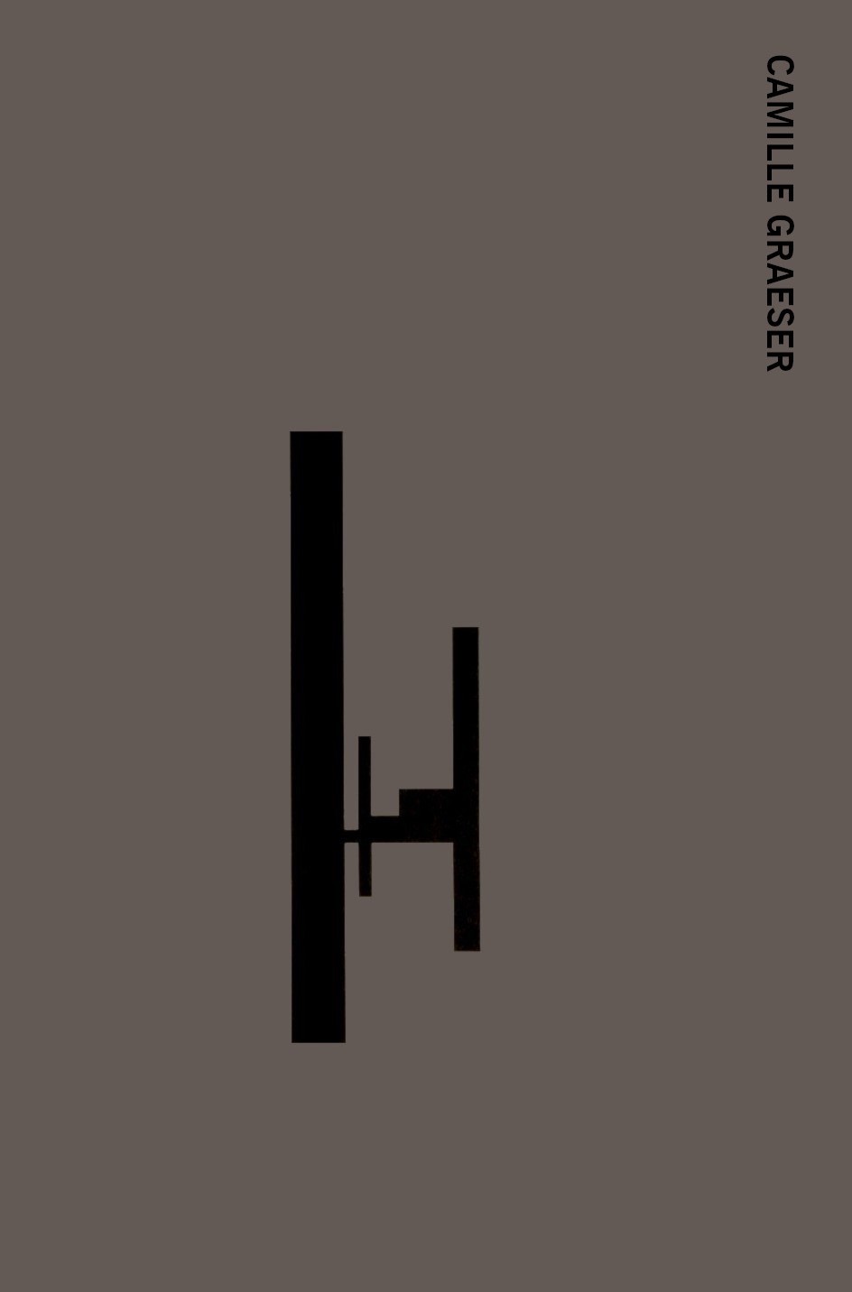
Bilingual edition German and English. Softcover with flaps, thread sewn, 16.4 x 24 cm, 196 pages. Publisher: Offizin Zürich Verlag. Design: Neugraphic.
Word and Sign
An exhibition at the Städtisches Museum, Wiesbaden, exploring the relationship between linguistic and visual forms.
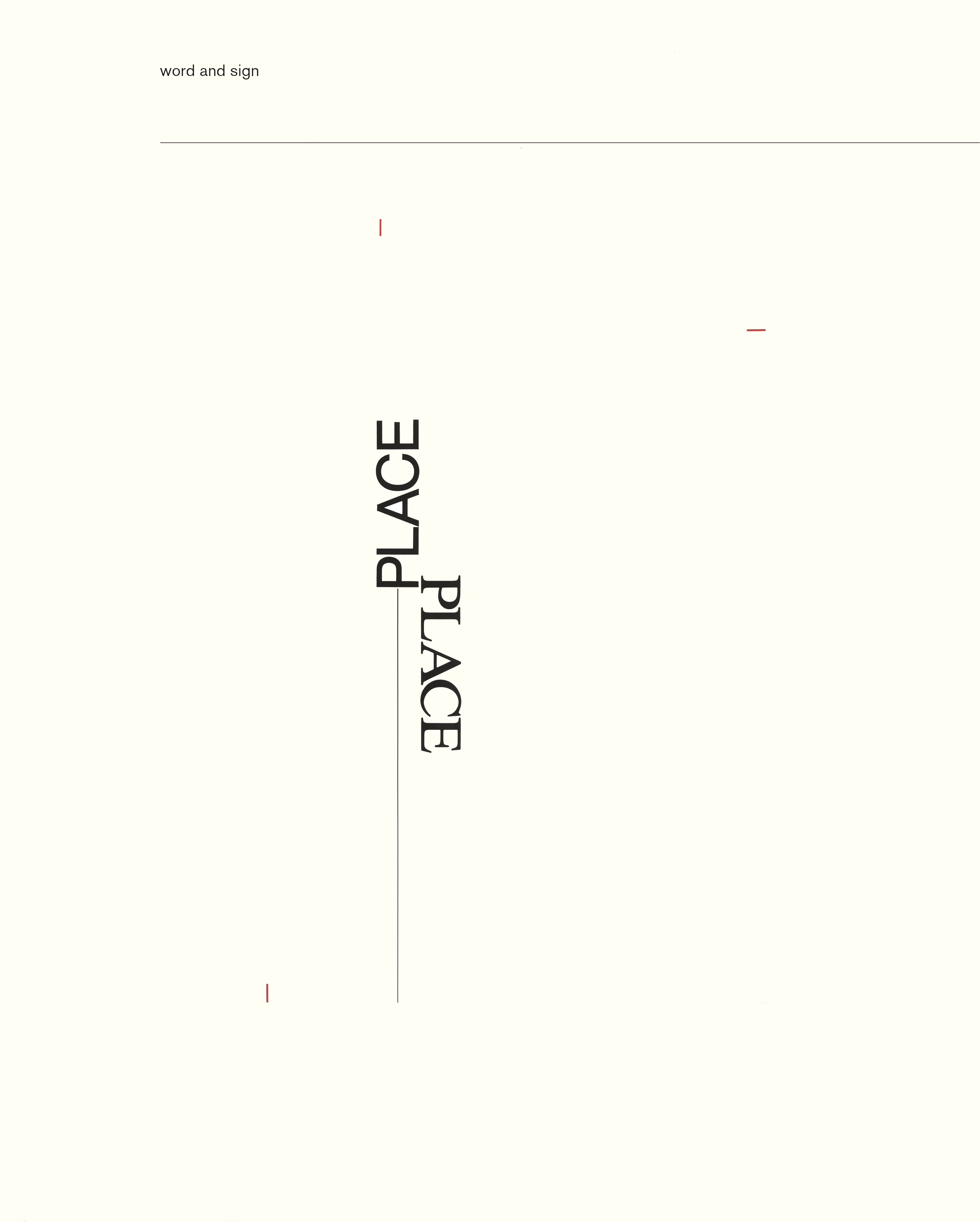
Text by: Karl Riha. Hardcover, sewn over 0.25 cm boards, 18.9 x 23.5 cm, 128 pages. Publisher: Wiesbaden, Städtisches Museum. Design: Neugraphic.