
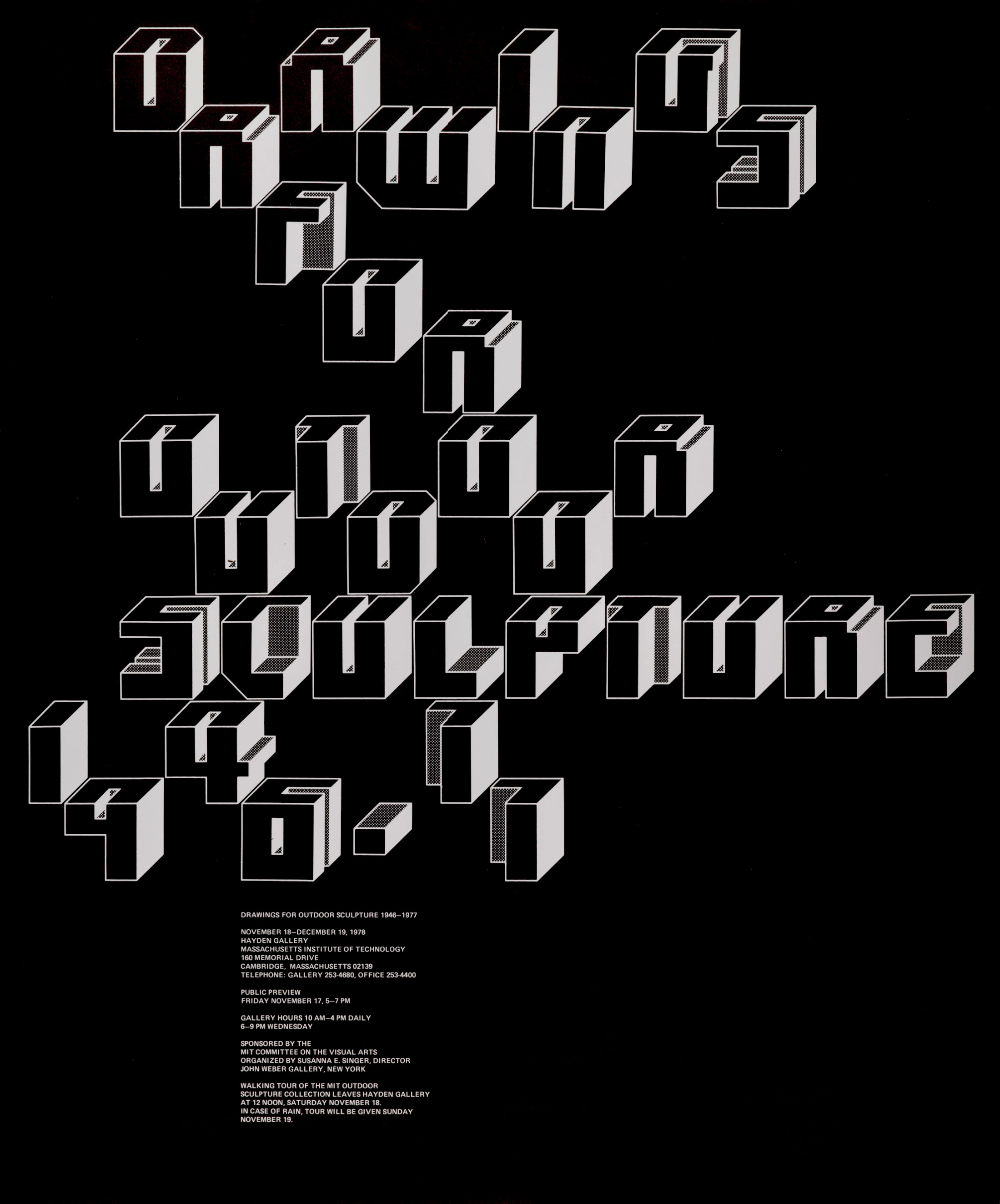
Jacqueline Casey, Drawings for Outdoor Sculptures. Poster, 1978
Jacqueline S. Casey: Steven Heller, Greg D’Onofrio
Jacqueline S. Casey practiced an inspired and functional Modernism. From 1955 to 1989, she was a designer in the Office of Publications (later renamed the Office of Design Services) at MIT, and in 1972 she was appointed its director. Casey said of her design, “My work combines two cultures: The American interest in visual metaphor on the one hand, and the Swiss fascination with planning, fastidiousness, and control over technical execution on the other.”
Born in Quincy, Massachusetts, Casey attended the Massachusetts College of Art (MassArt), where she received a bachelor’s degree in fine arts with a focus on fashion design and illustration. After graduating in 1949, she worked briefly in fashion, advertising, and interiors but never secured a job worthy of her interests; frustrated, she said, “I broke the negative cycle by traveling through Europe for three months” and returned “with the decision to focus my life on something related to the arts . . . to develop my visual sensitivity.”
Casey landed a job at MIT’s Office of Publications in 1955 designing summer session materials, recommended by her friend and fellow MassArt alumna Muriel R. Cooper (1925–1994), a pioneer feminist, designer, educator, and researcher with her own legacy as the first design director for the MIT Press. In the early fifties, the office had established “a graphic-design program enabling all members of the university community to benefit from free, professional design assistance,” wrote Philip B. Meggs. The department’s founder and director, John Mattill, was a science writer-editor whose Modernist vision was the guiding spirit for the early development of academic graphics. Cooper, who started as a freelance designer in 1952, was the department’s first office employee responsible for handling its graphics.
“In my early days at MIT, a designer working on summer materials would interview faculty and have a mini-course in a subject such as radioisotopes from the professor in charge. There was an opportunity to learn something new every day,” Casey recalled. In 1957, when Cooper left MIT on a Fulbright Scholarship, Casey became active in promoting a creative environment, responsible for designing posters, catalogs, and other printed collateral to help promote MIT events, programs, academic lectures, and art exhibitions, ranging from science to music to technology. Of her designs, Casey told Liz McQuiston in the 1988 book Women in Design, “My job is to stop anyone I can with an arresting or puzzling image, and entice the viewer to read the message in small type and above all to attend the exhibition.”
Eventually, the office grew to include two additional full-time designers: Ralph Coburn (b. 1923) from 1957 to 1988 and Dietmar Winkler from 1965 to 1970. Coburn, a proficient Modern painter, was “instrumental in fostering minimalist typography and design,” and he “became very comfortable in experimenting with different typographic systems.” Coburn “did not just adopt Swiss Design,” said Winkler, “he explored and expanded upon it . . . into a very personal approach.”
Over the years, Mattill invited European designers to work on summer session materials, including former Bauhaus student George Adams-Teltscher, Denis Postle and John Lees of England, Walter Plata of Germany, and Paul Talman and Thérèse Moll of Switzerland. American designers also made important contributions, among them Nancy Cahners, Bob Cipriani, David Colley, and Harold Pattek. Casey “had great trust in her colleagues’ abilities,” Winkler said, and furthermore, “we shared between us the same values.”
Of all the visiting designers, the one who left a lasting impact on Casey was Moll, who worked at MIT for a brief period in the summer of 1958. Moll had been a friend and assistant to Karl Gerstner in Basel. “She introduced the office to European typography [and was] well trained in the design of modular systems. This use of proportions in designing publications series became a useful tool,” Casey said. “It is important to have a process in which logic determines where things are placed. I use the grid because I won’t build a page without first laying the foundation.”
The MIT Office of Design Services played a critical role in helping popularize the Swiss gospel and the International Typographic Style throughout the United States during the sixties and beyond. Casey was heavily influenced by Gerstner, Armin Hofmann, Josef Müller-Brockmann, Emil Ruder, and Anton Stankowski and was well informed about contemporary photographers, artists, musicians, and writers. “The most constant part of my approach to design has always been the search for information. . . . It starts out with gathering material: an interview with the client, taking notes and establishing the client’s objectives, a library visit . . . determining the purpose of the communication, the audience, looking for any hint of special significance to make a more accurate and vital statement.”
Her designs were unified but rarely standardized. She explored modular abstraction, empty space and scale, and visual metaphors and language. Intrigued by the aluminized, silver paper that Tomoko Miho used in her Great Architecture in Chicago poster, she went on to experiment with metallic materials and inks. “Casey’s posters weave their magic through beautiful compositions and handsome typographic treatments,” noted Joseph P. Arnell. “But they are far more than pretty faces. Through a marriage of ideas and images, words and pictures, her posters make us stop, look and think. Then, they challenge us to understand.”
For Casey, who retired in 1989, “MIT was much more than a workplace. It was her identity and life, her home,” Winkler said. For more than thirty years, she was an accelerator of change, not only for MIT but for designers worldwide. “While MIT has its roots in tradition, the university represents all that is experimental, exciting, and future orientated. For me designing is highly personal and private,” Casey summed up. “My objective is to design a product with an accurate visual and verbal message that can be understood by the audience.”
Excerpt from The Moderns: Midcentury American Graphics Design. Abrams, New York, 2017