
Discussion 1 Wim Crouwel
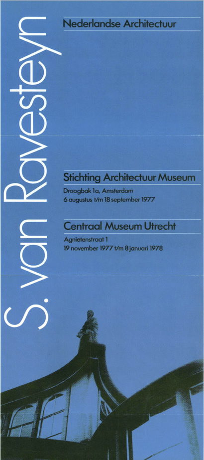
S.van Ravesteyn Poster 1977
I didn't plan to be a designer. My father was a lithographer so in the school holidays I worked in his block-making factory. I was sure that I wanted to go to art school, maybe to become a painter. I had an old-fashioned art school education: painting, sculpting, lithography, etching, watercolour and drawing. There wasn't a course in graphic design, but on the walls of our academy there were pieces by people like the early French poster artist Cassandre and we did produce posters, not to learn design but in order to have a subject for lithography.
Later on I appreciated the teaching because I learned skills through drawing and painting that I still use. I always have to sketch first with a pencil and through painting I learned about colour and tone. The further I am away from the experience the more I think it was actually very formative.
I left art school in 1949.I then had to do my military service, but by 1952 I was walking around Amsterdam, with my portfolio, going to advertising agencies and trying to get a job. They all said 'nice work but we don't have a job, we’ll call you when we do’. But they never called of course, so I felt lousy. That went on for a few months. I went through all my money but just at the right moment I went to an older colleague, Dick Elffers, and he helped me to find a job. He saw the designer in me. I am very grateful to the director of the company where I got that job, Mr Enderberg. It could have all been completely different. A friend of my brother had emigrated to Canada, as did lots of people after the war. He offered me a job in the lumber industry and I was thinking of going when Enderberg said to stay.
Help was being given by the Americans to regenerate Holland. This was part of the Marshall Plan to rebuild Europe after the war. We were commissioned to produce two exhibitions to encourage regeneration. They were on enormous ships that could float through Holland. It was a fantastic, ingenious thing. The architect of the installations was Italian and I worked with two other Swiss designers. These were very adventurous and formative years for me, particularly learning about the Swiss approach to modern design and typography. At the same time I did an exhibition in Amsterdam where I met the Swiss designer Karl Gerstner who was also to become an important influence on me.
I was a child of modernism, influenced by the period around 1930; a high time for modernism in painting, design, architecture and the Bauhaus period. In art school we were not taught about it, but in the early '50s, as soon as I discovered the beauty and logic of Swiss typography I thought 'this is it'. That was a real breakthrough. These connections made at the beginning of my career completely shaped what happened later. I also met the Dutch designer Piet Zwart. It was crazy that I did not know about him in art school. Modernism was far away from that school, although we were in a building that was the first modernist building in Holland. Maybe I was more influenced by the building than by the teaching. Anyway, by 1957 I had found my own way and was sure. I wasn't looking sideways any more. I was 29.
Looking at my early work you can see that I was searching for the right direction. I even searched for the right type to use. In 1957 we discovered Univers was the right answer. This was the first typeface where the 'x' height was the same in all weights when used at the same size. Bold, extra bold, light, you could use them in one line close to each other if you wanted. This was a real step forward.
In 1983 we started the company Total Design. The only typefaces we used for many, many years were Univers and Helvetica. If a client wanted something else there was initially some kind of fight. The publisher Abrams, for example, had asked me to design a book about Rembrandt's etchings, but felt that Rembrandt and Univers just ‘didn't go together'. Why should we try to get the kind of atmosphere of Rembrandt through the type, I asked? It's never real when you try to simulate such a thing. However, I didn't win the fight so I chose Bembo which the client liked very much. Whenever I have had to use a classic typeface, it is almost always Bembo and occasionally Garamond. Anyway, these are the only exceptions that you can find in all the work in my period at Total Design.
The English typographer Anthony Froshaug was also a hero of mine. I learned of him in 1959 when he was teaching at Ulm. I was absolutely intrigued by him. He was impossible, but a great man and a fantastic typographer and teacher. He was a typical English designer and yet he was a modernist. He visited me when he felt lousy and that was always Christmas time. He would come over to Holland and spoil my Christmas – fantastic! During those years I felt lousy too because I was divorced. Together we had lousy Christmases!
Later on in the '60s my interests were refreshed by minimal art. I found my roots again. Then, at the beginning of the '70s, the work of Robert Wilson in the theatre and the composer Philip Glass influenced my further development. I saw Robert Wilson's first opera. It was Baroque minimalism – absolutely fascinating.
When I look back, the 1950s were absolutely marvellous. For us it was absolutely glorious because we were rebuilding the country after the war. We all had this feeling.
The Dutch Federation of Applied Arts was founded in 1945 by museum director and graphic designer Willem Sandberg and others. There were graphic designers, interior designers, textile designers all under the umbrella of this Federation. It had a very idealistic approach. You could hardly become a member if you did not follow left-wing ideology that was demonstrated in your work. If you had been a collaborator in the war, for example, you couldn't join.
We had two associations at the time. The other was the Federation of Publicity Designers and Illustrators. In this society there were several members who had worked for the Germans during the war. Publicity design was regarded as something a little dirty because it is more overtly about making money. The notion of publicity seemed wrong; an attempt to influence people and restrict freedom of choice. So the associations were political enemies.
During the '80s we discussed merging the organisations. I left the board of the Federation of Applied Arts for a while because I didn't want to battle any longer. Once they merged I rejoined, but about ten members left permanently. They were the older members who were active during the war. People who had been part of the Resistance so they couldn't stand it.
I sometimes wonder what is driving designers today. I can understand why young designers are enthralled by the speed of technological development and that this is their focus, but there's a lack of idealism now. No utopian ideals, no belief that graphic design could be important in making this a better world.
That's what we believed until the end of the '60s when post-modernism came along. Until that moment we thought that a house-style was something to make people aware of the difference between companies, signage system was so you don't lose your way and typography was something neutral that should not stand between the sender and the receiver.
I miss that point of view today. I talk to younger designers who are active and intelligent and they have something else that makes them tick. I guess it is the fascination for the job in itself.
In the mid-1960s I read Complexity and Contradiction in Architecture by Robert Venturi. This marked one of the first steps towards post-modernist thinking. Venturi advocated combining fragments of old architectural devices with the modern, as you see, for example, in his work on the National Gallery extension in London. In the beginning these ideas seemed to be about a kind of romanticism, but the more I considered them the more convinced I was of my own modernist position.
I was teaching in Delft at the time. I have always advised my students to keep their radar going; everything that happens is important. Although I didn't like it I showed my students the work of post-modern designers. They needed to know in order to make an informed choice and when I was director at the Museum Boijmans van Beuningen we bought quite a lot of models from that period for the history department of the museum.
In Holland in the early '70s, combined with post-modernism, there was a wave of anti-design feeling. The feeling was that designers were destroying traditional aspects of life and spoiling the cities.
People turned against our company Total Design because they thought our objective was to unify everything. There were symposia, articles in the papers and magazines. In my opinion this was partly a result of post-modern thinking.
At the same time we saw other design offices springing up. We suddenly had competition. We didn't really have competition in the ‘60s. We had to cope with this just as society turned against design. The '70s were a kind of down period. I myself felt stronger and stronger though because the opposition helped me to develop.
There was a journalist who wrote weekly articles against design in quite an influential magazine. I was one of her targets. I still remember a symposium evening that the magazine organised when I was confronted by this journalist for the first time. Myself and colleagues explained our position then someone in the audience shouted 'fascist!' at me. They thought design was a form of fascism. It was very upsetting.
Then came the '80s and suddenly everything had to be 'designed', which really meant 'made pretty'. Professionally design flourished at this time. In the '90s new minimalism came in, but I didn't really trust it. Suddenly all designers were shaved bald and dressed in black. I was part of another design forum, on the same stage as previously, with five bald-headed, black-dressed British designers. They were all in the same uniform! It was crazy!
Most clients became friends. Even if it was very business-like, people trusted us, people knew what we stood for and that's why people came to us. We were the first design office in Holland and so we proved ourselves on some very important jobs. We visited the British designer FHK Henrion before we set up Total Design. He advised us that institutions like to talk to institutions. They like the guarantee that even if someone is ill the work will still go on. We went to Fletcher/Forbes/Gill too. They had just started the year before us and invented the idea of partners who had their own clients. So, we shaped our office to their model.
My client the director of the Stedelijk Museum was with me for 30 years. He was my dearest client and I did my best work for him. The shape of my whole career can be seen in that work. I was lucky that I had this cultural commission steadily going on while I was doing other business-orientated work too. One of the most interesting commissions I had was the design of the Dutch postage stamps. These lasted until the Euro arrived! Also my work on the New Alphabet, as this started an interest in computers and technology.
I never felt unsure. I feel myself just lucky. In Total Design we were able to do nice jobs and were not forced to accept things that we didn't want. However, compromise is something you have to live with. For example, we produced the corporate identity for SHV (Steenkolen Handels Vereniging). We discovered they had sub-brands that were not using our identity. We said this is against our idea of what corporate identity is and we had enormous discussions with our clients about whether we could accept this. We compromised because we understood that the realities of business required something other than a purely applied corporate identity. This experience made us grow up, it taught us a lesson. It's not even compromise, it's learning lessons.
I am of the generation who believe there is a large distance between painting and graphic design. The most important thing as a graphic designer is that you are dedicated to your commission, you find a solution. It has to do with responsibility. Design became, more or less, art when David Carson designed the magazine Raygun at the beginning of the '90s. The pages were beautiful in an expressionistic way, but you couldn't read the text. Occasionally I admit to feeling jealous of such a free approach, of not having this burden of the things we learned from modernism.
I worked like crazy. Probably my first marriage broke down because I was a workaholic. I think that if you want to achieve something professionally you have to work very hard. Maybe your private life should be number one, but my work was. I always have been ambitious, maybe a little less now. I'm afraid to be overloaded with things now and that has to do with my age. I think that people like Armin Hofmann and Karl Gerstner were more groundbreaking than I was, but in Holland I had quite an influence. The strictness of using grids, the way we explained our work, everything we did in Holland in corporate identity programmes was very important and groundbreaking now and then. Of course I felt a little envy of what some other designers did. For instance I admired Karl Gerstner greatly. He was my age. I have known him since 1952. He was theoretical, he was so strong, so sharp, and the books he published... one book after another and they were all very influential.
The strange thing is that in the '90s British designers were suddenly very interested in my work. The Foundry digitised my font designs, young British designers visited me and produced exhibitions of my work, only in England, very strange. Now the Japanese magazine Idea wants to produce 100 pages on me. That's half the magazine so I must be part of design history! Even if I don't believe it myself, others seem to.
I started teaching in 1954. Crazily young. I have always enjoyed it. I have taught all the time and loved it.
I love technology in general. I'm restoring an old car because I like the technology. I was always intrigued by technical inventions. In our profession I became very aware of it at the moment when letterpress printing disappeared and offset printing came in its place. We had to work in a completely different way. Then came the computer. In the '80s the first generation of phototypesetters arrived and I was immediately intrigued. The results were typographically awful and this inspired me to design fonts specifically for the computer.
That's why I made my New Alphabet. The computer has been very influential. We'd struggle with different layers in the '50s, doing a lot of things by hand for offset printing. Now you can do 12 layers easily and produce layouts that we couldn't dream of.
I am a positive thinker, I always have been. There is constant change and every period is fantastic and interesting. I'm not pessimistic at all. I see that there is a lot of rubbish produced but there always has been. Even in the '50s, when we thought we'd found the solution, there was rubbish produced. It multiplies but the good stuff does too. So percentage-wise it's the same amount of good to bad.
I would hardly know how to start now and I'm not jealous of the young people today who have to because it's very difficult. On the other hand once you see the possibilities then it's a fascinating period. I would always advise to find out as soon as possible what your strong points are and develop them. When you are strong you can absolutely reach something. For me 1957 was a very important year because I found out what my strengths were and also what I should not do. All things considered I would do it all again the same way.