
Weingart: Typography. My Way to Typography
Typographische Monatsblätter, Number 5/1973.
FOURTH INDEPENDENT PROJECT: LETTERS AND TYPOGRAPHIC ELEMENTS IN A NEW CONTEXT
In an era when lead type was virtually obsolete, the environment of a traditionally equipped type shop—its elements and tools in metal, wood, or synthetic materials—was the context, in fact, the impetus that enabled me to develop a progressive curriculum for the Künstgewerbeschule Basel.
Swiss typography in general, and the typography of the Basel school in particular, played an important international role from the fifties until the end of the sixties. Its development, however, was on the threshold of stagnation; it became sterile and anonymous. My vision, fundamentally compatible with our school’s philosophy, was to breathe new life into the teaching of typography by reexamining the assumed principles of its current practice.
The only way to break typographic rules was to know them. I acquired this advantage during my apprenticeship as I became expert in letterpress printing. I assigned my students exercises that not only addressed basic design relationships with type placement, size, and weight, but also encouraged them to critically analyze letterspacing to experiment with the limits of readability.
“We discovered that as increased space was inserted between letters, the words or word groups became graphic in expression, and that understanding the message was less dependent upon reading than we had supposed.
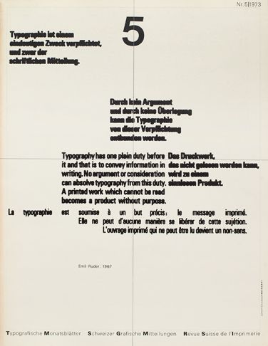
Our activities challenged the viewpoint of Emil Ruder and his followers. In the mid-sixties he wrote a succinct manifesto, a part of which I typographically interpreted for the cover of Typographische Monatsblätter, Number 5/1973:
“Typography has one plain duty before it and that is to convey information in writing. No argument or consideration can absolve typography from this duty. A printed work that cannot be read becomes a product without purpose. More than graphic design, typography is an expression of technology, precision, and good order.”
Founded by Emil Ruder and Armin Hofmann, the Weiterbildungsklasse für Graphik, the international Advanced Program for Graphic Design, was scheduled to begin in April 1968. Ruder’s heartfelt wish was to teach typography, but because of additional obligations as the school director, he would need a teaching assistant. He asked me, and I readily accepted. Tragically, his unexpected illness and regular hospital confinements in Basel precluded the chance of ever working together.
The first seven students came from the United States, Canada, England, and Switzerland, expecting to study with the masters Hofmann and Ruder. When I showed up as the typography teacher, their shock was obvious. Because of my training and radical experiments, and because we were around the same age, the students began to trust me. Eventually, disappointment gave way to curiosity.
“The teachers agreed on common themes for the initial two years of the advanced program, the symbol and the package. Feeling more confident by the second year, bolstered by the students’ enthusiasm, I risked further experimentation, and my classes became a laboratory to test and expand models for a new typography.
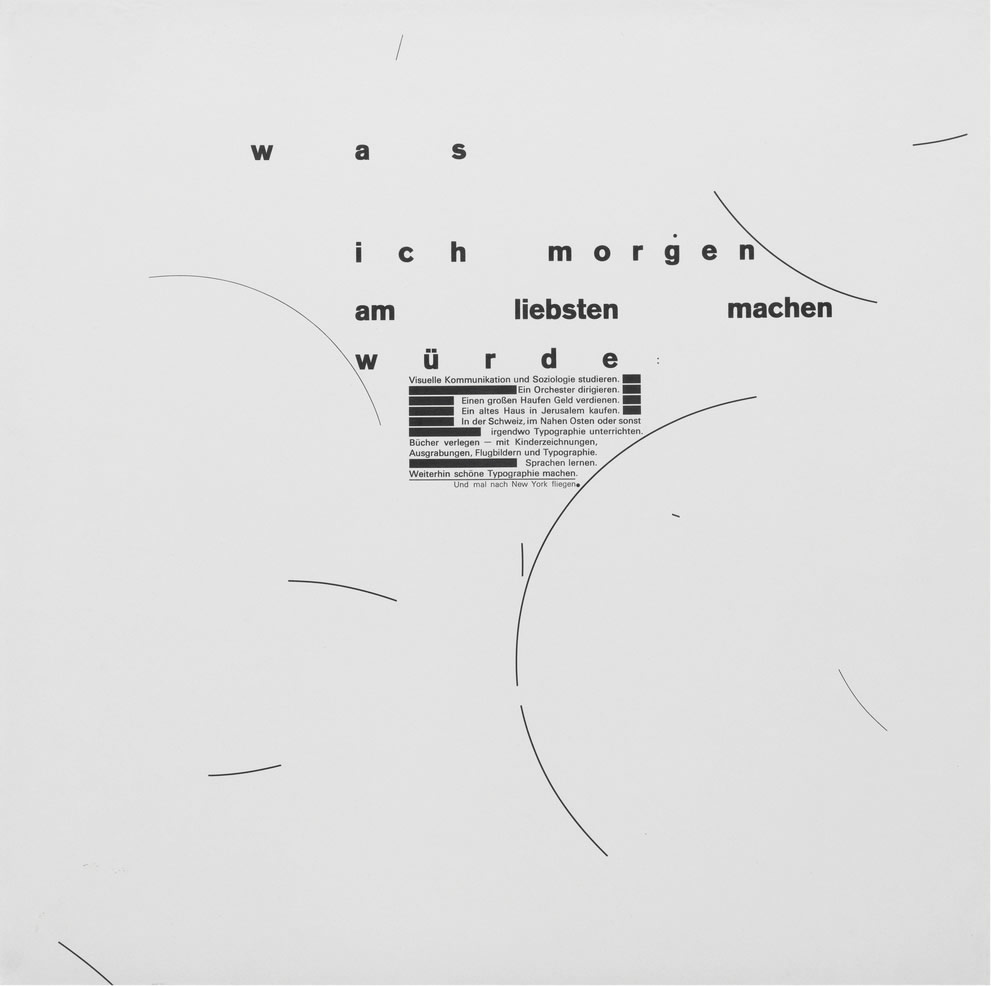
It was a major undertaking to organize my extremely diverse typographic ideas when I was asked to exhibit at the Stuttgart gallery Knauer-Expo in December 1969. I designed eleven broadsides relating to thoughts and fantasies about my life. One of them, entitled “was ich morgen am liebsten machen würde” (what I would most like to do tomorrow), was a list of wishes and dreams, and it has become one of my favorite works.
Accelerated by the social unrest of our generation, the force behind Swiss typography and its philosophy of reduction was losing its international hold. My students were inspired, we were on to something different, and we knew it.
FIFTH INDEPENDENT PROJECT: TYPOGRAPHY AS ENDLESS REPETITION
Years after our explosive rebellion against the prevailing status of Swiss typography and all the values that it had come to embody, my work, too, became repetitive. Disheartening as it was, I had to admit that our school type shop, although well stocked in metal type, rule lines, symbols, and ornaments, flexible in all possible techniques, no longer offered creative potential, not for me personally and not in the professional practice of design.
Since the invention of printing, typography had been the domain of craftsmen. The artists and designers of the twenties and thirties, the so-called pioneers of modern typography, El Lissitzky, Kurt Schwitters, Piet Zwart, whose work anticipated a future direction in graphic design, perhaps came to a similar dead end due to the inherent limitations of perpendicular composition in lead typography.
“In my case the crisis came at the beginning of the seventies when the student unrest had subsided, when many of us were trying to envision a new life. The renewed challenge to find other possibilities in my work, to find my way out of a leaden typographic cage, seemed futile.
It was too soon to imagine the potential of layering lithographic films. Nor could I predict that in the darkroom another world of surprise awaited: transparency and superimposed dot screens.
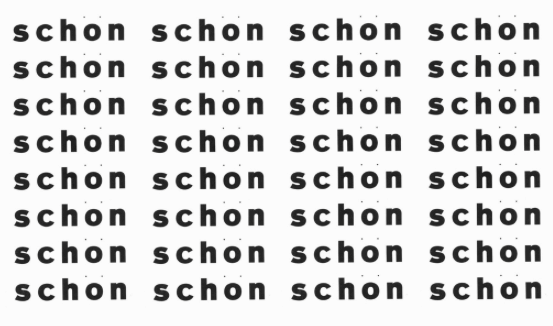
From a feeling of nowhere to go, a low point and a standstill, I set repeated, single type elements. The pictures conjured up many associations: the endless expanse of the desert, the steps of archaeological sites, the discipline of my apprenticeship, and, from childhood, the drudgery of survival in a postwar economy and a report card with the failing grade that would never improve—in Germany, the number 1. Lines that spanned a double-page spread reminded me of first grade in Salem Valley and my practice notebook for handwriting. The word “schön,” set in bold with two fine points above it, defined my idea of beauty. “The rows of Rs were elephants with their long trunks, a peaceable herd roaming a dry river valley at the foot of a steep mountain massif. The cross, the registration mark of the printer, was the intersection of north, south, east, and west. The letter Y was a dichotomy, the arid desert strewn with colorful tulips. Pages of bold points and vertical lines were abstractions of photographs brought back from journeys in the Near East.”
“This phase of my work may well have been influenced by Serial Art, or by Repetition Typography practiced in the class of Emil Ruder during the sixties. The typeface Univers designed by Adrian Frutiger of Switzerland, a longtime friend of Ruder, offered Basel a progressive approach to the arrangement of typography. The design of Univers was ideal for Ruder’s own typographic work and that of his students, especially favored by Hans-Rudolf Lutz who studied at the Basel school for one year from 1963 to 1964. Lutz and a few of his colleagues designed typographic pictures that would have been difficult to compose in any other typeface.
Since the invention of book printing, Univers was the first entire font system to be designed with interchangeable weights, proportions, and corresponding italics. In the design of older typefaces visual alignment among such variations was not a standard consideration. For a given size of type all twenty-one variations of Univers, whether light, regular, medium, bold, condensed, expanded, or italic, had the same X-height (the height of lowercase letters without ascenders or descenders) and the same baseline. “This simplified letterpress printing and increased the possibilities for visual contrast in tone, weight, width, and direction, available in eleven sizes for metal typesetting.
When I came to the Basel School of Design the coarse Berthold Akzidenz-Grotesk, so rarely used, was fast asleep in the type drawer under a blanket of dust. I woke it up.