
How Can One Make Swiss Typography? Theoretical and practical typographic results from the teaching period 1968–1972 at the School of Design Basle
First published in 1972 in a photocopied edition of two hundred copies and distributed during a lecture tour of design schools and universities throughout the United States.
I am happy that I can be with you today, especially because your invitation has given me my first opportunity to visit America. I have not come here to bring you something like the typographic message of salvation from the Old World, but instead to inform you about my school activities in Basle.
I deliberately do not say 'teaching activities' because the thinking, ideas, and typographic models that I want to show you are not only the results of my teaching in Basle, they are also the results of my intensive, private occupation with typography and graphic design. Both sides are not as separated from one another as I seem to imply—on the contrary, as you will see for yourself later.
Because I come from Switzerland and because the concept 'Swiss Typography' is probably connected with a fixed idea for you, I would like to supplement my introduction. I want especially to show you that not only one conception of typography exists in Switzerland. Simply stated, at least two directions exist. One direction is the well-known, moderate-objective or rational direction, with its design principles and methods. Another direction is a newer tendency towards a lively, relatively free kind of typography that renounces extensive design dogma, and tends to look unorthodox. But this second direction is unthinkable without the classical 'Swiss Typography: in that it is a logical further development of it.That is the kind of typography which, together with my students, I have tried to develop for the past five years. With that, I end my introduction.
I would like to summarize what you can expect in the next sixty minutes: a confrontation with the legendary concept of 'Swiss Typography: and a very personal statement of a very personal concept of typography and typography education. (For some people, maybe too personal).
But first, the answer to a question which I am repeatedly asked, and perhaps one that may be in the minds of some of you here: 'How did you come to teach typography in Basle, Weingart?
The short answer is that in 1963, by chance, I met Armin Hofmann. Actually, I only wanted to inquire about his and Emil Ruder 's classes. I showed a few typographic designs that I had brought from Germany, and as far as I can remember there were three designs in particular (right) which enabled me to begin study with both teachers one year later.The attempt to learn typography with Emil Ruder failed. I felt myself less of a student, and more of an observer. In this role I remained free from typographic dogma, and critical in the face of design criteria. Also, the contact with Armin Hofmann was, at that time, very short—he left our school for some time and went to the national Design Institute in Ahmedabad, India. In that respect, I feel that I am neither a Hoffmann student, nor a Ruder student, but instead, self-taught.
Through my way of making typography, and through publications in technical journals, my relationship to the Basle School was distant but friendly, especially with Armin Hofmann, who has actively supported my ideas all along. I can still remember the question in 1963 as to whether I would like to teach typography for him in the near future.
In spring 1968 the Advanced Course for Graphic Design was started, and today, as far as I know, it remains a solitary model in Switzerland, as well as the rest of Europe. It is attended predominantly by foreign students, the majority from America. Within this course, a position in the typography faculty was open, and so I began.
Up until that time it was accepted that the typography teachers and students would teach and learn typography according to the patented concept of 'Swiss Typography'
What then, is to be understood by the term 'Swiss Typography?' We can attempt to explain this complex concept perhaps with the aid of these five especially typical examples:
With them, you can see that certain design principles are very predominant. That is, certain characteristics like the type style, design structure and gray value became immediately obvious in the trained observer. Everything is based on the right angle, and everything is ordered with regard to materials and the hand setting process. The essential goal is to implicate the unprinted white space as a design factor. The criteria for this are the two rather puritanical concepts of ‘information' and its 'readability,' which, in their complex meaning, are simplified. We are in agreement that today, in spite of all the progress and knowledge in communications research, there is no reliable definition of what is a reasonable, fair, unmanipulated message, completely aside from the question of whether there could, or even should be such a definition. Furthermore, it is also difficult to explain how a message could be translated, typographically, yet remain effective.
Here is where I began, because when all of the previous questions are unanswered, then 'Swiss Typography' can be only one of many possible directions, and in no way, as some of its advocates assume, the absolute typography. The deciding factor for me is to take the design criteria of 'Swiss Typography' as a sensible point of departure, and through teaching and experimentation, to develop new design models. Since the beginning, I have been conscious of what my responsibilities are as a typography teacher in Basle. It was never the idea to throw either 'Basle' or 'Swiss Typography' overboard, but rather to attempt to expand them—to enliven and change them with the help of intensively considered design criteria and new visual ideas. Finally, the reason for this lecture is to present the results of a relatively short period of development in both our class work and my own experimentation.
I think I should explain what I understand by the terms 'teaching method' and 'school.' It seems important to me, because such a definition will make the following pictures and theories more understandable.
'School,' for me, is an institution which, through a certain teaching program, attempts to clarify certain information. This information is essentially independent from the concrete demands made by existing professional standards.The teaching programs are open, not bound by fixed opinions. The content of the program is determined and constantly developed in the school. It is important that 'school' maintains an experimental character.The students should not be given irrevocable knowledge or values, but instead, the opportunity to independently search for such values and knowledge, to develop them, and learn to apply them.
The result of such schooling is not a programmed typography, but instead, a typography or graphic designer who, as a starting-point in his practical work, has the possibilities and potentialities of typography design in his grasp. This view is actually the trademark of the Basle school: providing thorough basic knowledge about design possibilities and constantly developing and building upon this knowledge. Not just the finding of pre-set design patterns, but instead, the attempt to train the senses to recognize alternative design directions, and to use each of these directions with equal importance, instead of searching for typographic expression, our educational goal is to find differentiated typographic solutions.
In my typography class one can find both middle-axis and strong grid styles beside the freer, more flexible exercises.The prerequisite, exclusively, is that for every solution a design criterion must be developed. With that, the individual freedom is so large that, for example, an 'ugly' design can become a 'beautiful' design.
I hope that my short definition has made clear to you what kind of school' we are striving for in Basle, and how these ideas operate relative to the goals, methods and criteria of my typography course. Then, when you know these didactic ideas, you will find that the abundant possibilities of 'Swiss Typography,' which I will show you, are a natural consequence of them.
With that, I believe I have clarified why I must speak about typography instruction, if I want to speak about typography. For me, one is not possible without the other.
Back to our theme: 'How Can One Make Swiss Typography?' Obviously the question has a double meaning. Its first objective is 'Swiss Typography,' although, as we have seen, no one actually knows exactly what 'Swiss Typography' is today. The second aim of the question is that of the 'making' of typography, which is in itself questionable, in that it is quite difficult to make something that one cannot exactly define. The answer to my two-sided question is: Firstly, all of the examples from my typography courses and any personal work are 'Swiss Typography'—they have been made in Switzerland, and stem from classical Swiss typography. Secondly, you will learn about the 'making' of this typography, in that I shall discuss its entire design process—that is, the preliminary, conceptual, and design considerations, as well as our final criteria.
I do not want to overlook a discussion about typography's right to exist. I think that its existence has a sense, as long as we have something to communicate – and that is as human beings, with very differentiated sensual needs, not as automatons with factual information needs, capable of being mechanically satisfied.
Despite this, I am not sure about the value and position of typography in today's communications scene. Certainly, typography today does not have, and cannot lead, its own life; much less so than in earlier times. But what does this 'own life' mean? Actually nothing more than life from itself, for itself, sufficient.
In contrast, this inside cover of the Rolling Stones' record Exile on Main Street is exactly the opposite. The attempt is much more to express visually those specific Rolling Stones' qualities of hard-rock subculture aesthetics and nonconformist attitudes: 'shabby-beautiful.' A German music critic and non-designer said of this 'anti-design idea: 'This cover, with all its vulgarity and tastelessness, works like an ironlc comment on the polished image which the Rolling Stones acquired, in the eyes of many critics, after their last English tour.'
This cover questions the conventional concept of typography, which commonly means that which can be set and printed. As we knew, this idea is very limited. It originated from a handcraft ideology, in which there was no place for important modern reproduction methods.
In contrast, we define typography today as one of many design fields in which the object is to produce communication. We, the typographers, determine what the specific typographic means are, and which of these are to he used.
This is an example from the 1971 Peter Stuyvesant campaign in West Germany, which is probably unfamiliar to most of you.This campaign, which was one of the most successful ever in German advertising, ran for almost ten years with the slogan `The Aroma of the Great Wide World: After the firm had decided to develop a newer, more modern campaign, the problem was how to retain, at least partially, the old and successful conception. One does not just throw away that which has functioned so well. As you can see in the solution, only 'The Aroma' is placed above the Peter Stuyvesant pack with the words 'of the Great Wide World', being supplied by the mind of the German consumer.
The result in advertising, as strong conceptual ideas move to the foreground, design is pushed into the background. What is the function of typography here? For example, is readability a problem in this case, which must be solved with sensitivity?
It is because I think this way that my relationship with typography remains unbroken. I see the uncertainty, but I have it less than many other typographers. For me there have never been any typography problems, but instead, only typographic problems.There is no competition between text and picture, but instead, an alliance.
Although there is no picture involved, this example demonstrates clearly what I mean. At first, one recognizes only a kind of technical organization of the typographic elements, but with more critical observation, one realizes that the life of the design lies in its syntactical values. That is, from the connection between such elements as type, format and placement. I believe it is exactly here, in the expression of the syntactic moment, that the decisive criteria lie, in that here the graphic or total configuration comes to fruition.
A parallel example: a printed word can only function when the letters are placed in the correct syntactic order. But upon viewing the word, one is not conscious that the syntactic plays such a role. In other words, it becomes evident only when one of the letters is in the wrong position. Basel is readable for a German speaking person, and embodies a geographical location, whereas the world Basle is not. On the other hand, the word Basle is understandable to an English speaking person. Basel: German, Basle: English.
I would like to introduce the theoretical concept of syntax here, because it is something of a key concept in understanding my view of typography. It is a kind of fix-point in my design goals, and the drive behind my didactic work. From now on, I will be repeatedly speaking about syntactic, semantic, and pragmatic relationships in typography. Some of you are probably not familiar with these elementary concepts in relation to a so-called communications theory, so I have made a diagram which should help illustrate the functions of signs. The point of departure is what one means by a 'sign.' In this case the word 'breast' has two meanings: the man's breast and the woman's breast. It is a word with two completely different meanings. This printed word does not just stand there; it means something, a certain 'breast; which in our case will be a man's breast. The fact that a sign only functions as a sign when it refers to something, or should mean something, is called its 'semantic sign-function?
This sign, or typographic word-picture,'breast; is composed of different basic signs, or letters. The relationship of the letters to one another and to the paper, is called the 'syntactic sign-function' of a sign. And of course it's clear that a sign can only function as a sign when there is someone there to read it, which means a sign must be made in such a way that it can be seen, read and understood. This 'effect of a sign belongs in the area of 'pragmatic. sign-function! This simple model demonstrates a communication process that does not function very well.The receiver (3) of the message 'breast,' understands a woman's breast, which is something different than the sender (1) actually intended. This is a problem which we all share. Our designs produce different effects. Our signs can acquire a meaning other than that intended.
In answer to the question posed as the theme for this lecture, I would like to say that one can only make typography today if one understands its syntactic dimension. More simply stated, the syntactic dimension in typography is, for me, a new territory. Here I see an undiscovered, surprising visual vocabulary, with more effective design methods for supplying information. Naturally, these new possibilities are not within easy reach; these first bits of knowledge and first new patterns cannot immediately be transposed to a practical level, especially not in today's world of consumer advertising, which is based upon immediate visual exhaustion.The syntactic differentiation of typographic material is more difficult to achieve in such fields as consumer advertising, and is only plausible where there is a receptive, thinking audience. Here I close the range of ideas.
What is the essence of my method of teaching typography? My most important goal in the typography class is to show the interested students—and it is only possible for me to work with such students—all the possibilities that lie in a typography workshop. And then, to place these possibilities in connection with the individual design problems of each student. By possibilities, I mean both the materials and technical processes available in a workshop.
For me, typography is a triangular relationship between design idea, typographic elements, and printing technique. Every problem in my class is handled from these three aspects, none of which should ever fail. The thing that is so special for me, with regard to the value I place on typographic syntax, is the variability of the materials under the influence of idea and technique. This means finally, the flexibility with which typography can function and still retain its meaning, in relation to different kinds of problems. All of the following examples were made with these considerations in mind. They are free from every fashionable tendency found in advertising and design. They are neutral, and comparable in a visual sense with basic mathematical exercises.
I hope that this introduction has sufficiently prepared you for the following examples. It was bit longer than I had planned, but I will confine my discussion of the pictures to only that which is necessary. I have divided the picture material into chapters. These chapters relate to the different problem areas found in my classes. The themes that are dealt with in these chapters increase in complexity, in the same way that the problems and methods in my classes over the years have become more complex. In this way you can become a student of mine for a while. Forget that you already know something about typography—possibly too much. Put aside your typographic experiences, prejudices and aesthetic preconceptions, at least for the next forty minutes.
TECHNICAL WORK AND ELEMENTARY TYPOGRAPHY
Imagine that you need my course and have no ideas about typography. As your most important goal you want to experience as many typographic possibilities as you can in perhaps two years, and become independent.
Our first exercise is as follows:
In the first few hours I instruct you in typesetting techniques and related problems.You set a ragged-right composition, print it and attempt to improve it optically. From this ragged-right composition you now make compositions of block, middle-axis, and free line placements.
When you have these abilities at your command, we can proceed to the second exercise. I give you a typewritten manuscript which you set in one type size. That is why you have learned to set type during the first exercise. Only the printed word is reality, not that which has been sketched or made from blind text. Only with a set and printed word can you realize its actual length, its relationship to other words and to the entire text, as well as to your predesignated space.
The text and format of the next exercise (above) is also devised to deepen your first experiences of the division of space; through the study of the placement of letters and lines and their interrelationships, and with the aid of a certain self-determined program, you attempt to organize visually your name and address within a given area.
With the same limitations, you attempt to solve a more complex, practice-orientated problem. You attempt to visualize the logic and content of the text. You try to find functional typographic design possibilities, based on criteria like readability, text organization, and visual quality.
At this point, a slight digression is necessary: it is a mistake to assume that typography instruction for graphic designers is not very meaningful, or to say that the teaching of elementary typography problems is superficial, in that any intelligent student can master them by himself. To this I would like to reply that the more basic a problem is stated, the more difficult it becomes to solve. Complex problems allow mistakes and superficialities to be more easily hidden.
Because we have already pushed these elementary exercises somewhat too far, let us solve another functional problem as an end to this first chapter. You have to design a business letterhead conforming to the DIN system, the German industrial Norm system, which is also valid in Switzerland.
As already stated, I am convinced that such elementary typographic exercises are a prerequisite for the solution of complex typographic design problems. Only here can the eyes, mind and feelings be equally and gradually trained, and only here can one learn to deal confidently with format, space, proportion and composition. Beyond that, these basic exercises provide insight and knowledge into general typographic problems, and are indispensable in the execution of concrete practical problems. Only when the student has understood that making typography means the visual organization of a given space with regard to a specific functional intention, will he be in a position in the future to make independent typographical decisions, regardless of whether the emphasis lies on dealing with complex practical problems or on experimental work. Obviously, I see that a bit idealistically.
The most important result of these basic exercises is that the student develops a relatively open relationship to everything that has to do with typography. He is in a position to explode the old venerable concept of typography—at least in the syntactical sense. In opposition to fixed traditions, he is less rigid in dealing with the materials and technical opportunities of the workshop. He has learned that a composed word need not look like a composed word. For example, the conventional word-picture for Swissair, and with it the word Swissair set with an increasing progression from bottom towards top, which becomes a semantically changed word-picture. In this case Swissair is an airline company which, through the progression of the letters, has a part of its most typical activity visualized—that of flying; the form rises into the air. The student has now realized that the material is not, as in classical typography, stiff and only applicable in a very limited way.
This picture shows the technically limited possibilities of hand-setting—the horizontal and vertical. The student should have the courage to violate the respected laws of lead typography when it is necessary
for the effectiveness of the typographic composition. He then knows that in letterpress almost everything can be printed, and in offset, everything.
THE SYNTACTIC DIMENSION IN TYPOGRAPHY
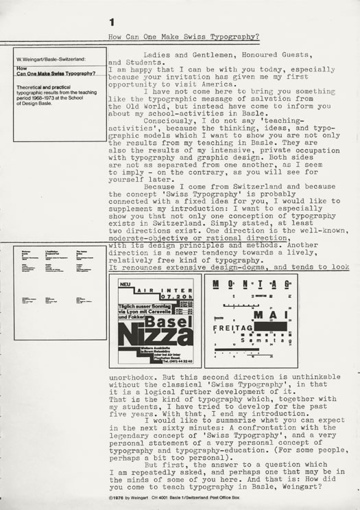
As you can see, the arrangement of examples into chapters is not meant so precisely. Naturally in the basic exercises we began working with the connection of typographic elements to one another. Next, I began to distribute different problems to the students—more complex problems that demand greater effort—naturally, with consideration to levels of talent and interest. Our fifth problem is really an expansion of the previous ones. The text is more complex and you have first one, then two, and finally many type sizes at your disposal, to develop a series of very different results.
In these Swissair advertisements for a daily newspaper, you have the possibility to completely exhaust the interpretative possibilities contained in the text and flight-plan. There are fewer restrictions in relation to type material and design freedom. These further examples demonstrate a strong contrast and clear tension in the typographic design materials used. They show advertisements for the Swiss Post, Telegram and Telegraph Service (PTT), which are published on the back covers of telephone books. They contain information about the different services offered by PTT.
Here is a poster for the Trans-European Express (TEE). We have set ourselves the goal of connecting different semantic interpretations with one another. The method for this should be the application of different syntactic design material: middle-axis composition (upper left and at the bottom); block composition, with extreme word and line spacing (upper right); block composition, spaced in decreasing progressions (lower left); block composition without additional manipulation (lower right).
The work that I have shown you is very diverse because the students themselves are very different from one another. They differ in their basic educations, interests and abilities, as well as their nationalities. Often there are as many as six different nationalities on one course. On average, I figure on one-fourth convinced opposition, one-fourth convinced support, one-fourth not convinced support, and one-fourth misdirected professionals. As you can imagine, this is a fundamental handicap for any lesson or teaching method. There are some students—often the majority—who are very dependent on their respective teachers and constantly want to be led. Only a few are in a position to search, find, and decide independently.
This frequently intense student-teacher relationship is naturally the cause of a certain uniformity in the results from the class. To this often-made reproach against both the school and myself, I would say two things: Firstly, what teaching method does not lead to a certain uniformity? Regardless of where I look I see only gradual differences. Secondly, these more or less evident traces of uniformity in the work are not of primary importance, but instead, what is important is the foundation upon which they are built. I admit that our school does in a certain sense produce uniform results—in a visual sense. But at the same time I think that the exercises enable the students to transfer their underlying knowledge and ability to a position whereby, during practical work, each can reach completely different kinds of results. Obviously, this is not so easily generalized—it is important to take into consideration the extent to which the personality, intelligence, and ability of the student has been developed.
As I've already mentioned, I place great importance on these examples and the working process that leads to them.They are loosening-up exercises for the design student, similar to elementary exercises in which the emphasis is placed not so much on familiarity with the materials and technical aspects, as on expanding the typographical design vocabulary. The student discovers a visual language—the visual language. I mean that when the lesson functions correctly, every student should learn how to assert himself When the teacher is colorful and stimulating enough in what he does, the student will receive enough stimulus for the development of his individual abilities and ideas.
Finally, I do not give the student any recipes to take with him, but instead only models for the solution of specific problems. Within the different kinds of problems set, the student has enough opportunity to practice coming to terms with both the problems and himself. But as I said, I see the problem very clearly and I am conscious that it cannot be fully explained with a few quick sentences. The so-called school crisis talked about today is not as noticeable in Basle as in other similar institutions. From what I have seen, the crisis is visible in other countries, especially in Europe. Today, few schools can or want to function as in earlier times. Obviously, the reason is that both classical understanding of one's self and the social role of the school as an adaptable institution have broken down. But I believe—and risk saying it—that there is another reason: not only has this `self-understanding' broken down, but also, so has 'discipline. There is no reliable teaching concept any more, no program on which an education can be based—not even a reliable direction which one could follow.
Everyone does what he wants. What is missing are good teachers and lecturers. I do not know of one school today in Germany, for example, which continues the methodical pioneer work begun by the Bauhaus. It was attempted by Ulm, but with different prerequisites and in another environment—and you know how that ended. With the example of Ulm you can see what I mean, in that Ulm was mined by, among other things, the loss of its three dominant personalities: Max Bill,Tomas Maldonado, and Bonsicpe. Certainly, today's students want nothing to do with such strong domineering personalities. But I am opposed to this. If we want to reconstruct, to not only look for but also realize new directions, we need strong, flexible, and active personalities.
THE SEMANTIC DIMENSION IN TYPOGRAPHY
The basic exercises in my classes are syntactic exercises. But in working with the synthetic dimension the semantic cannot he excluded. By that I mean activating that part of typography dealing with the meaning of the design elements.
As I mentioned at the beginning, what is decisive for me in my instruction is the typographic aspect of typography. This is not just a question of syntax, but instead, a question of semantic evaluation of the syntactical elements.
Naturally, our exercises on this theme are very limited in that we are not a scientific institution, which could, with large technical expenditure, conduct tests related to the semantic quality and effectiveness of typographic signs. In that respect our exercises remain relatively subjective. But with experience and a healthy human understanding at our disposal, we experiment with the character of letterforms, their sizes and associations, as semantic factors. One could say that we are expanding the visual vocabulary of design alternatives. But, in certain respects, we go much further than any scientific testing can, in that empirical science with its social-scientific testing methods can in general deal only with the expectations and known experiences of those tested. Only in rare cases can something new be deduced from such information.
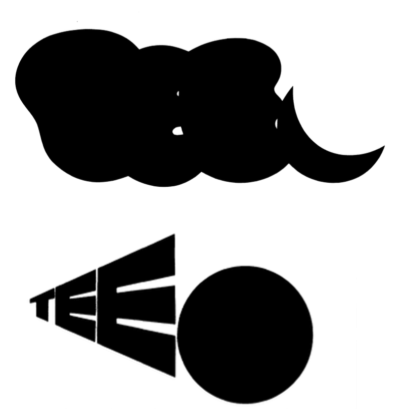
As an example, some years ago I received a hint from the disciplined and intelligently solved logotype for Arabian Airlines. I tried to determine if the Arabic association function only because the i dot was turned on its corner.
Or is it perhaps just as good with simple round dots, which are not normally used with this typeface, Helvetica?
I am sure you find, as I do, that the effect of the turned square cannot be surpassed. As proof of the quality of this visual idea—which is definitely an idea, and not a product of so-called syntactic research–I placed it in confrontation with a line of Arabic script. One realizes where the connection of this most ingenious microaesthetic invasion into our western lettering structure lies—in the dots—which in Arabic script, are determined by the writing implement.
Here are some other examples that I found in Israel. They support my theory that certain graphic modifications in typography, or lettering, can intensify the semantic quality of typography as a means of communication. Conversely, the lack of such modifications in normal typography reduces the associative semantic dimension of typography as a means of communication. The famous Coca-Cola trademark looks different in Hebrew—but still awakens an immediate association—because we identify certain essential characteristics of this well-known supersign. We are all able to recognize such associations, either consciously, or, as in the case of the less visually aware, subconsciously.
It is completely different with the internationally known concept 'Police'. Although this lettering appears on a jeep, we would not be able to decode the Hebrew word for police if the English word was deleted. To us, it could just as well be a military jeep. The typographic signs in the English version are then without semantic value.
A similar situation occurs with the geographical concept 'Tel Aviv', which when spoken evokes a large number of associations, none of which can be found when looking at this street sign. In order to orientate ourselves in Israel, we need letterforms that are familiar to us.
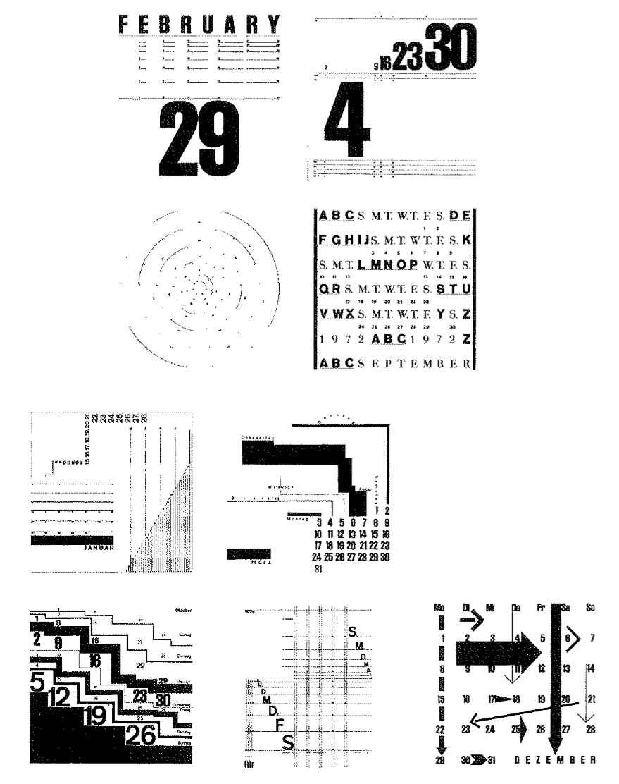
Although they are still in the early stages, here are some examples of what has resulted from our exercises with the semantic dimension and its syntactic associations. I will explain the concepts and adjectives that served as semantic goals for each of the respective problems. Shown here are two semantic interpretations of the three letters, TEE, for Trans-European Express. Comfortable sleeping: the round forms represent 'clouds: which are soft and should lead to the association with 'soft bed.’ The quarter moon supports this idea of ‘bed’ and a ‘night’s’ sleep through associations with 'dreaming' and 'romantic nights.' Fast to the destination: the extreme perspective of the capital letters and the movement 'towards a point' or 'towards a goal, should help visualize the racing tempo of this long-distance, high-speed train.
Obviously, these examples do not have much to do with 'typographic design: but they do offer a very good view of the overlap between graphic design and typography, especially with reference to problems that emphasize the semantic. To that extent they function as preliminary design exercises, or as 'building blocks' in the design process of a poster or logotype.
This example illustrates the type of development in our design process. You can see the steps with which we came to the desired result of a semantic interpretation of the concept 'Bible.'
Firstly, we set the word 'Bible' as it is commonly known.That is, readable, and with the normal letters of our alphabet.
Secondly, we considered how we could best interpret this concept visually. We selected one possible interpretation; the 'classical' origins of the Bible.Then we considered with which letters of the alphabet it is possible to visually delete this specific semantic interpretation.
Finally, we placed the selected basic letters together to form the new supersign 'Bible'
This new word-picture awakens semantic associations with 'old greek lettering’ or 'classical' Bible. We attempt to stimulate and secure our ideas through material studies during the design process—that is, to convey the individual idea in a generally understandable form. In the ease of the word 'Athens,' we investigated the structure and then the written origins of the Greek letterforms. In the typography workshop, we attempt to properly represent the characteristics which we discover, with the letters and line material at our disposal.
To what degree can we change the nature of the letter O? At which point can we still identify it as an O? In other words, what is the most typical visual characteristic necessary for it to be recognized? Can the semantic value of the capital letter H be changed? In what way does its meaning develop through differentiation in weight and proportioning of the typographic line material?
In this exercise, the process of exploring free ideas is given greater emphasis than the conscious utilization and application of these discovered typo-signs as trademarks or logotypes. Despite the lack of a given specific problem, the student can clearly see the connection of typography to graphic design.
PURE DESIGN-TYPOGRAPHY AS 'PAINTING'
In case you sometimes have the impression that we work in a bit of a vacuum, I would like to show you what working in a vacuum really means. In all of our work we are conscious that we have an empty space, a vacuum, which we must fill with typographic elements.
For both myself and my students, I would say that the fascination of typography lies with its ability to transform a silent, unprinted piece of paper, with the aid a rigid signs, into a dynamic form of communication.
HOW DOES BASLE DIFFER FROM OTHER SCHOOLS
I have already spoken to you many times about 'Swiss Typography' in relation to our work in Basle. But there are many different schools in Switzerland, each with very different concepts of typography.
How do my ideas differ from the others? In reply, I would like to show you some more typical examples of 'Swiss Typography:' five designs from Emil Ruder and his students. The main criterion for the form of typographic design is 'readability.' It is the dominant factor in the selection and optical organization of the typographic signs. The 'message' to be communicated is not intensified through the use of additional syntactic or semantic material.
To question the motive behind such an attitude towards typography, is to question the attitude towards communication in general. For a long time there has been a tendency in 'Swiss Typography' to deliver a message in a 'value-free' manner. 'Value-free' means to present a message simply, and not to equip it with additional visual characteristics to heighten its semantic and persuasive effectiveness. Here the ethics of the designer are very much involved.
Without bringing ethics into question, we can say that this 'value-free' attitude towards a 'message' is only one of many. However, even the most objective information, with the most sober visual presentation, still connects the receiver with personal values.
This idea, contained in 'Swiss Typography' and striven for in Switzerland and other countries—of pure functional organization, with its grid, unified typeface, type size, and semantic restraint—is a vain wish. It can only be one part of complex function that distinguishes typography as a means of communication.
The human being has more than just technical and economic needs. He has very differentiated psychological needs, especially in those areas that have to do with culture and aesthetics. That is, those areas which we call `design? This is a social-psychological platitude from which advertising, with intelligent ideas, lively texts and visualizations, has already profited greatly. (This was very amusingly formulated as well as ideally practiced by the grand advertising philosopher, Howard Luck Gossage.)
Of course these are only some examples from an abundance of other designs with which I could have illustrated the concept of 'Swiss Typography! In contrast, these designs from the Basle advertising agency GGK, show how something can look when one tries to make interesting typography from cold and objective subject matter.
These last two examples show clearly that 'Swiss Typography,' at least in Switzerland, is in a state of radical change. Or differently stated today, in Switzerland at least, no one knows anymore what the specialists actually mean when they bestow the honorable predicate 'Swiss Typography.'
Returning to the actual question: How does my concept of typography and typography instruction differ from other such concepts in Swiss schools?
Basically, these concepts do not differ. Good or bad, we are all building on the classical 'Swiss Typography.' We completely accept the fundamental principles of the purity and precision of typographical material, its logical and disciplined structure, and the meaning of the white space in a design. We are all sure that these 'values' will never be false.
Perhaps the reason for this is that Switzerland offers every person working creatively very special conditions, which for these people means something like a unified 'fertile base.' In both its domestic and foreign policy Switzerland is an extremely stable country. In a positive sense, peace and order prevail and a respect for people who think differently is still guaranteed. For the individual, that means the freedom to work uninterruptedly on his or her own projects.
After having recognized the similarities to other schools, I would now like to discuss the differences. You can see from the examples of work which I've shown you from my students and myself that we consciously emphasize the syntactic possibilities in typography. Occasionally, you have probably thought that this is harmful to the readability of a text. But I think that the relatively high stimulus of such a text is adequate compensation for low readability. What good is readability when nothing in the text attracts one to even read it? Naturally this attitude leads to continued attempts to break away from trusted design patterns. We attempt to test experimentally the semantic and syntactic possibilities of typography, and to break through its ideological borders by consciously ignoring the traditional limits and recipes for typographic design. Also, we try to remain blind to the gags and trends of the international advertising and design scene. With my definition of 'school,' I have attempted to explain why we are so logical and sometimes a bit too self-conscious in our work.
It would be unfair to present our school and its typography teaching methods only in a positive light. We also have ideas about how we can better reach our teaching goals through improved didactic means. One of the problems is our almost exclusive occupation wills syntactic and semantic design problems in typography. But this is only an outward expression of something completely different.That is, the real problem of the meaning of a text. In my opinion one cannot make really good typography without exact knowledge and precise understanding of a text.The study of the meaning of texts, through special and theoretical lectures, seminars, and exercises, is completely missing in our programs. Our action-radius of 'typographic design' is quite small within a theoretical model for a communications process.
As you can see from my self-critical remarks, we are aware of the deficiencies at our school.The attempt to remedy this situation has been frustrated by many problems. Firstly, by the organization and institutional structure of our school. Secondly, by the very limited time at our disposal to cover the various areas of our typography program. And finally, the entire problem is embedded in the general social process of changing consciousness and the new order of social and cultural values.Thus, we are again confronted with the questions of the definition and goals of 'school; and with the value and nature of typography.
IN CONCLUSION: WHAT' SHOULD THE CORRECT TYPOGRAPHY EDUCATION CONTAIN?
What should an ideal design school be like? And with reference to my own field of activity, what should a 'correct' typography education consist of? Perhaps I can outline a definition of the goals that the typography course most fulfill. Basically, I see three categories:
1. The value of typography within the most diversified communication processes, and its efficiency as a means of communication, must be redefined. Such a redefinition would be an attempt to expand the meaning and range of the concept 'typography.'
2. In the future, new information technology and changing forms of communication will obviously require additional new typographic standards in relation to the syntactic and semantic. The substance of typography must change, along with the information it has to convey, and the general cultural scene in which it must function.
3. Finally, although it may be a subjective and perhaps provocative statement to make, I feel strongly that this new typography must also—and I emphasize also—be the result of a very personal thought process in design. By that I mean those efforts based upon individuality, imagination and artistic qualities.
In the second half of this century, as in the first, we need personalities who can influence the development of typography through their personal contributions. From the simplified goals I have outlined above, one can begin to see possibilities for change in the educational system. Certainly in the future, a study of typography must include a study of the meaning of 'text.'
If we want to build upon the theme of 'text,' and expand in the direction of conceptual work and communications planned, we will need input from new fields such as: sociology, communications theory, semantics, semiotics, computers, and planning methods. Furthermore—as experience has shown in the more advanced schools–we need flexible technicians who are capable of combining specialized knowledge with an understanding of design problems.
But first and foremost, we need schools in which such challenges can be instigated and realized. I know that these challenges are not new, but I place them here at the end of my statement because they are derived from personal experiences within my typography course. My own work and that of my students, as a typographic development process, can only logically progress, when, with the aid of our acquired experiences and knowledge, we can reform both the educational system and its teaching methods. Concepts of typography, such as those we are trying to develop in Basle, contain more than simply the expansion of the syntactic and semantic vocabularies. We do not want to produce a kind of 'design cream' to be skimmed off by the agencies and studios.
We attempt to educate human beings who can, with imagination and intelligence, make responsible typographic contributions to the formation of the environment, especially the future environment, whose problems are already becoming evident.